First impressions matter more than ever in the quickly changing digital world of today. One of the first things people do when they visit a website is frequently to navigate to the signup page. The signup page is where users choose whether to proceed and interact with your brand, be it to create an account, subscribe to a service, or join a community. It is an important part of the entire user experience (UX) and goes beyond just a functional form. Your website will appear more reliable and professional with an attractive and popular signup page. When consumers are met with a modern and eye-catching design, they are more assured that they are interacting with a trustworthy company.
The user’s experience on your website can be positively or negatively impacted by the signup page’s functionality, layout, and design. An attractive signup page can give your website the advantage over thousands of other websites fighting for the same user’s attention in the fiercely competitive online world. Making an easy-to-use process that turns visitors into devoted users is just as important as making a statement. An effective signup page is one of the most important components for success because it establishes the tone for the user’s interaction with the website.
One of the first interactions a potential user has with your website or app is through the signup page. This page frequently acts as the entry point for user engagement.
This first interaction is critical because it can influence how they perceive your brand overall. A disorganized, unclear, or outdated signup page may discourage visitors before they’ve had a chance to explore your offerings.
On the other hand, a simple and welcoming design promotes professionalism and trust, motivating users to register. Remember, first impressions matter. A well-designed signup page can create a favorable impression on visitors.
As we move through 2024, several web design trends are influencing contemporary signup pages. Users appreciate the clarity and simplicity of minimalist design, making it a popular choice. This approach frees users from unnecessary clutter, allowing them to focus on completing the signup process.
Vibrant gradients are another trend that can enhance visual appeal and direct users’ attention to key components, like the signup button. Additionally, subtle animations play an important role, giving the form a dynamic feel and keeping users engaged as they fill it out.
To improve the user experience (UX) overall, a well-designed signup page is essential. Users are more inclined to complete the signup process when they encounter a simplified and easy-to-understand flow. A streamlined approach not only minimizes frustration but also encourages users to engage with your brand.
The signup button plays a critical role in this process. It should be prominent and clearly labeled, making it easy for users to understand the next action they need to take. Elements like a clear call-to-action (CTA) are crucial for guiding users effectively through the signup journey. By drawing attention to the button and ensuring its visibility, you help users feel confident in their decision to sign up.
In today’s digital landscape, where an increasing number of people access websites from mobile devices, responsive design is vital. It’s important to ensure that your signup page looks and functions seamlessly on all screen sizes. A responsive layout enhances accessibility, allowing users to complete the signup process regardless of the device they are using.
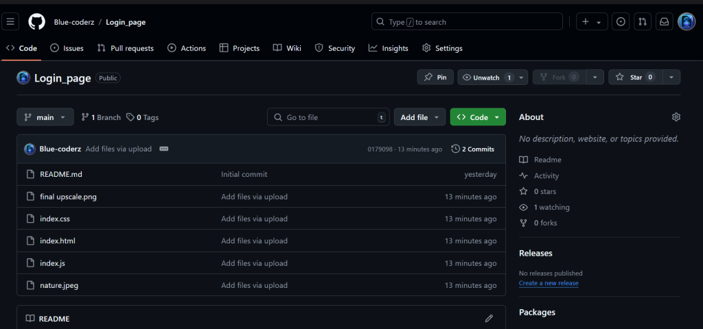
when you create a file of HTML , CSS , JavaScript -> have make a change in your index.css in that ->
download a image or copy the image which is mention is there in the github or downlaod the image which i used in the code directly below and place the image in place of ‘nature.jpeg’
if you have a good knowledge in makeing a lone of a repository in git hub you can direclty do that below :
[{"id":4359,"link":"https:\/\/aspirepages.in\/javascript-projects-for-beginners-draggable-puzzle\/","name":"javascript-projects-for-beginners-draggable-puzzle","thumbnail":{"url":"https:\/\/aspirepages.in\/wp-content\/uploads\/2025\/07\/JavaScript-Projects-for-Beginners.webp","alt":"JavaScript Projects for Beginners \u2013 Draggable Grid Puzzle Mini Project Tutorial with Source Code"},"title":"JavaScript Projects for Beginners: Build a Draggable Grid Puzzle 2025 (Mini Project Idea)","author":{"name":"narenkumar","link":"https:\/\/aspirepages.in\/author\/narenkumar\/"},"date":"Jul 18, 2025","dateGMT":"2025-07-18 19:31:58","modifiedDate":"2025-07-18 17:36:00","modifiedDateGMT":"0000-00-00 00:00:00","commentCount":"0","commentStatus":"open","categories":{"coma":"<a href=\"https:\/\/aspirepages.in\/category\/coding-projects\/\" rel=\"category tag\">Coding Projects<\/a>, <a href=\"https:\/\/aspirepages.in\/category\/developer-resources\/\" rel=\"category tag\">Developer Resources<\/a>","space":"<a href=\"https:\/\/aspirepages.in\/category\/coding-projects\/\" rel=\"category tag\">Coding Projects<\/a> <a href=\"https:\/\/aspirepages.in\/category\/developer-resources\/\" rel=\"category tag\">Developer Resources<\/a>"},"taxonomies":{"post_tag":"<a href='https:\/\/aspirepages.in\/tag\/beginner-javascript-project\/' rel='post_tag'>Beginner JavaScript Project<\/a><a href='https:\/\/aspirepages.in\/tag\/coding-projects-for-beginners\/' rel='post_tag'>coding projects for beginners<\/a><a href='https:\/\/aspirepages.in\/tag\/drag-and-drop-grid\/' rel='post_tag'>drag and drop grid<\/a><a href='https:\/\/aspirepages.in\/tag\/draggable-elements-js\/' rel='post_tag'>draggable elements js<\/a><a href='https:\/\/aspirepages.in\/tag\/draggable-grid-puzzle\/' rel='post_tag'>draggable grid puzzle<\/a><a href='https:\/\/aspirepages.in\/tag\/frontend-mini-project\/' rel='post_tag'>frontend mini project<\/a><a href='https:\/\/aspirepages.in\/tag\/grid-layout-project\/' rel='post_tag'>grid layout project<\/a><a href='https:\/\/aspirepages.in\/tag\/html-css-js-puzzle\/' rel='post_tag'>html css js puzzle<\/a><a href='https:\/\/aspirepages.in\/tag\/interactive-ui-project\/' rel='post_tag'>interactive ui project<\/a><a href='https:\/\/aspirepages.in\/tag\/javascript-drag-and-drop\/' rel='post_tag'>javascript drag and drop<\/a><a href='https:\/\/aspirepages.in\/tag\/javascript-projects\/' rel='post_tag'>javascript projects<\/a><a href='https:\/\/aspirepages.in\/tag\/learn-javascript-2025\/' rel='post_tag'>learn javascript 2025<\/a><a href='https:\/\/aspirepages.in\/tag\/mini-javascript-projects\/' rel='post_tag'>mini javascript projects<\/a><a href='https:\/\/aspirepages.in\/tag\/puzzle-game-javascript\/' rel='post_tag'>puzzle game javascript<\/a><a href='https:\/\/aspirepages.in\/tag\/web-development-puzzle\/' rel='post_tag'>web development puzzle<\/a>"},"readTime":{"min":9,"sec":58},"status":"publish","excerpt":""},{"id":4346,"link":"https:\/\/aspirepages.in\/website-connection-test-html-js\/","name":"website-connection-test-html-js","thumbnail":{"url":"https:\/\/aspirepages.in\/wp-content\/uploads\/2025\/07\/website-Connection-Test.webp","alt":"responsive website connection test interface using HTML CSS JavaScript"},"title":"Create a Website Connection Test in 3 Minutes Using Pure JavaScript (Free Code)","author":{"name":"narenkumar","link":"https:\/\/aspirepages.in\/author\/narenkumar\/"},"date":"Jul 11, 2025","dateGMT":"2025-07-11 18:30:16","modifiedDate":"2025-07-11 17:21:38","modifiedDateGMT":"0000-00-00 00:00:00","commentCount":"0","commentStatus":"open","categories":{"coma":"<a href=\"https:\/\/aspirepages.in\/category\/coding-projects\/\" rel=\"category tag\">Coding Projects<\/a>, <a href=\"https:\/\/aspirepages.in\/category\/developer-resources\/\" rel=\"category tag\">Developer Resources<\/a>","space":"<a href=\"https:\/\/aspirepages.in\/category\/coding-projects\/\" rel=\"category tag\">Coding Projects<\/a> <a href=\"https:\/\/aspirepages.in\/category\/developer-resources\/\" rel=\"category tag\">Developer Resources<\/a>"},"taxonomies":{"post_tag":"<a href='https:\/\/aspirepages.in\/tag\/aspirepages\/' rel='post_tag'>aspirepages<\/a><a href='https:\/\/aspirepages.in\/tag\/automation-ready-projects\/' rel='post_tag'>automation ready projects<\/a><a href='https:\/\/aspirepages.in\/tag\/beginner-web-tools\/' rel='post_tag'>beginner web tools<\/a><a href='https:\/\/aspirepages.in\/tag\/browser-connectivity-check\/' rel='post_tag'>browser connectivity check<\/a><a href='https:\/\/aspirepages.in\/tag\/check-if-user-is-online\/' rel='post_tag'>check if user is online<\/a><a href='https:\/\/aspirepages.in\/tag\/check-internet-connection-javascript\/' rel='post_tag'>check internet connection javascript<\/a><a href='https:\/\/aspirepages.in\/tag\/connection-test-for-websites\/' rel='post_tag'>connection test for websites<\/a><a href='https:\/\/aspirepages.in\/tag\/css-animation-effects\/' rel='post_tag'>css animation effects<\/a><a href='https:\/\/aspirepages.in\/tag\/custom-alert-box-html\/' rel='post_tag'>custom alert box html<\/a><a href='https:\/\/aspirepages.in\/tag\/detect-network-status\/' rel='post_tag'>detect network status<\/a><a href='https:\/\/aspirepages.in\/tag\/free-source-code\/' rel='post_tag'>Free Source Code<\/a><a href='https:\/\/aspirepages.in\/tag\/front-end-mini-projects\/' rel='post_tag'>front-end mini projects<\/a><a href='https:\/\/aspirepages.in\/tag\/frontend-project\/' rel='post_tag'>frontend project<\/a><a href='https:\/\/aspirepages.in\/tag\/html-css-javascript-mini-project\/' rel='post_tag'>html css javascript mini project<\/a><a href='https:\/\/aspirepages.in\/tag\/html-css-js\/' rel='post_tag'>html css js<\/a><a href='https:\/\/aspirepages.in\/tag\/internet-connection-detector\/' rel='post_tag'>internet connection detector<\/a><a href='https:\/\/aspirepages.in\/tag\/internet-status-checker\/' rel='post_tag'>internet status checker<\/a><a href='https:\/\/aspirepages.in\/tag\/javascript-coding-example\/' rel='post_tag'>javascript coding example<\/a><a href='https:\/\/aspirepages.in\/tag\/javascript-for-beginners\/' rel='post_tag'>javascript for beginners<\/a><a href='https:\/\/aspirepages.in\/tag\/javascript-internet-checker\/' rel='post_tag'>javascript internet checker<\/a><a href='https:\/\/aspirepages.in\/tag\/website-connection-test\/' rel='post_tag'>website connection test<\/a><a href='https:\/\/aspirepages.in\/tag\/website-offline-detector\/' rel='post_tag'>website offline detector<\/a><a href='https:\/\/aspirepages.in\/tag\/website-speed-checker\/' rel='post_tag'>website speed checker<\/a>"},"readTime":{"min":12,"sec":38},"status":"publish","excerpt":""},{"id":4225,"link":"https:\/\/aspirepages.in\/animated-cube-javascript-project-with-source-code\/","name":"animated-cube-javascript-project-with-source-code","thumbnail":{"url":"https:\/\/aspirepages.in\/wp-content\/uploads\/2025\/06\/Copy-of-Planet-Arcadia-6-1.png","alt":"JavaScript Project with Source Code Featuring Animated Cube and Error Fixes"},"title":"Animated Cube JavaScript Project with Source Code: 4 Common JavaScript Mistakes Made & How to Fix Them + Free Code & Line-by-Line Explanation","author":{"name":"narenkumar","link":"https:\/\/aspirepages.in\/author\/narenkumar\/"},"date":"Jun 5, 2025","dateGMT":"2025-06-05 18:55:38","modifiedDate":"2025-06-05 16:29:54","modifiedDateGMT":"0000-00-00 00:00:00","commentCount":"0","commentStatus":"open","categories":{"coma":"<a href=\"https:\/\/aspirepages.in\/category\/coding-projects\/\" rel=\"category tag\">Coding Projects<\/a>","space":"<a href=\"https:\/\/aspirepages.in\/category\/coding-projects\/\" rel=\"category tag\">Coding Projects<\/a>"},"taxonomies":{"post_tag":"<a href='https:\/\/aspirepages.in\/tag\/ai-chatbot-tutorial\/' rel='post_tag'>AI Chatbot Tutorial<\/a><a href='https:\/\/aspirepages.in\/tag\/beginner-chatbot-project\/' rel='post_tag'>Beginner Chatbot Project<\/a><a href='https:\/\/aspirepages.in\/tag\/build-chatbot-with-javascript\/' rel='post_tag'>Build Chatbot with JavaScript<\/a><a href='https:\/\/aspirepages.in\/tag\/chatbot-with-html-css-js\/' rel='post_tag'>Chatbot with HTML CSS JS<\/a><a href='https:\/\/aspirepages.in\/tag\/gemini-api-javascript-example\/' rel='post_tag'>Gemini API JavaScript Example<\/a><a href='https:\/\/aspirepages.in\/tag\/gemini-chatbot-integration\/' rel='post_tag'>Gemini Chatbot Integration<\/a><a href='https:\/\/aspirepages.in\/tag\/google-gemini-api\/' rel='post_tag'>Google Gemini API<\/a><a href='https:\/\/aspirepages.in\/tag\/how-to-create-a-chatbot\/' rel='post_tag'>How to Create a Chatbot<\/a><a href='https:\/\/aspirepages.in\/tag\/javascript-chatbot\/' rel='post_tag'>JavaScript Chatbot<\/a>"},"readTime":{"min":36,"sec":19},"status":"publish","excerpt":""},{"id":4218,"link":"https:\/\/aspirepages.in\/toast-catcher-javascript-project\/","name":"toast-catcher-javascript-project","thumbnail":{"url":"https:\/\/aspirepages.in\/wp-content\/uploads\/2025\/06\/Copy-of-Planet-Arcadia-4-1.png","alt":"JavaScript Project \u2013 Toast Catcher Game with HTML CSS JavaScript for beginners"},"title":"Toast Catcher JavaScript Project for Beginners Using HTML & JavaScript in 3-Step Tutorial with Free Code","author":{"name":"narenkumar","link":"https:\/\/aspirepages.in\/author\/narenkumar\/"},"date":"Jun 3, 2025","dateGMT":"2025-06-03 18:41:47","modifiedDate":"2025-06-03 17:19:42","modifiedDateGMT":"0000-00-00 00:00:00","commentCount":"0","commentStatus":"open","categories":{"coma":"<a href=\"https:\/\/aspirepages.in\/category\/coding-projects\/\" rel=\"category tag\">Coding Projects<\/a>","space":"<a href=\"https:\/\/aspirepages.in\/category\/coding-projects\/\" rel=\"category tag\">Coding Projects<\/a>"},"taxonomies":{"post_tag":"<a href='https:\/\/aspirepages.in\/tag\/ai-chatbot-tutorial\/' rel='post_tag'>AI Chatbot Tutorial<\/a><a href='https:\/\/aspirepages.in\/tag\/beginner-chatbot-project\/' rel='post_tag'>Beginner Chatbot Project<\/a><a href='https:\/\/aspirepages.in\/tag\/build-chatbot-with-javascript\/' rel='post_tag'>Build Chatbot with JavaScript<\/a><a href='https:\/\/aspirepages.in\/tag\/chatbot-with-html-css-js\/' rel='post_tag'>Chatbot with HTML CSS JS<\/a><a href='https:\/\/aspirepages.in\/tag\/gemini-api-javascript-example\/' rel='post_tag'>Gemini API JavaScript Example<\/a><a href='https:\/\/aspirepages.in\/tag\/gemini-chatbot-integration\/' rel='post_tag'>Gemini Chatbot Integration<\/a><a href='https:\/\/aspirepages.in\/tag\/google-gemini-api\/' rel='post_tag'>Google Gemini API<\/a><a href='https:\/\/aspirepages.in\/tag\/how-to-create-a-chatbot\/' rel='post_tag'>How to Create a Chatbot<\/a><a href='https:\/\/aspirepages.in\/tag\/javascript-chatbot\/' rel='post_tag'>JavaScript Chatbot<\/a>"},"readTime":{"min":15,"sec":57},"status":"publish","excerpt":""},{"id":4209,"link":"https:\/\/aspirepages.in\/responsive-ai-chatbot-template\/","name":"responsive-ai-chatbot-template","thumbnail":{"url":"https:\/\/aspirepages.in\/wp-content\/uploads\/2025\/06\/Copy-of-Planet-Arcadia-3-1-1.png","alt":"Responsive AI chatbot UI built with HTML CSS and JavaScript"},"title":"Create a Responsive AI Chatbot Template in Under 3 Minutes (HTML, CSS, JS) + Free Source Code + Setup Guide","author":{"name":"narenkumar","link":"https:\/\/aspirepages.in\/author\/narenkumar\/"},"date":"Jun 2, 2025","dateGMT":"2025-06-02 19:34:10","modifiedDate":"2025-06-02 18:26:51","modifiedDateGMT":"0000-00-00 00:00:00","commentCount":"0","commentStatus":"open","categories":{"coma":"<a href=\"https:\/\/aspirepages.in\/category\/coding-projects\/\" rel=\"category tag\">Coding Projects<\/a>, <a href=\"https:\/\/aspirepages.in\/category\/ai-automation\/\" rel=\"category tag\">AI & Automation<\/a>","space":"<a href=\"https:\/\/aspirepages.in\/category\/coding-projects\/\" rel=\"category tag\">Coding Projects<\/a> <a href=\"https:\/\/aspirepages.in\/category\/ai-automation\/\" rel=\"category tag\">AI & Automation<\/a>"},"taxonomies":{"post_tag":"<a href='https:\/\/aspirepages.in\/tag\/ai-chatbot-tutorial\/' rel='post_tag'>AI Chatbot Tutorial<\/a><a href='https:\/\/aspirepages.in\/tag\/beginner-chatbot-project\/' rel='post_tag'>Beginner Chatbot Project<\/a><a href='https:\/\/aspirepages.in\/tag\/build-chatbot-with-javascript\/' rel='post_tag'>Build Chatbot with JavaScript<\/a><a href='https:\/\/aspirepages.in\/tag\/chatbot-with-html-css-js\/' rel='post_tag'>Chatbot with HTML CSS JS<\/a><a href='https:\/\/aspirepages.in\/tag\/gemini-api-javascript-example\/' rel='post_tag'>Gemini API JavaScript Example<\/a><a href='https:\/\/aspirepages.in\/tag\/gemini-chatbot-integration\/' rel='post_tag'>Gemini Chatbot Integration<\/a><a href='https:\/\/aspirepages.in\/tag\/google-gemini-api\/' rel='post_tag'>Google Gemini API<\/a><a href='https:\/\/aspirepages.in\/tag\/how-to-create-a-chatbot\/' rel='post_tag'>How to Create a Chatbot<\/a><a href='https:\/\/aspirepages.in\/tag\/javascript-chatbot\/' rel='post_tag'>JavaScript Chatbot<\/a>"},"readTime":{"min":18,"sec":29},"status":"publish","excerpt":""},{"id":4200,"link":"https:\/\/aspirepages.in\/file-uploader-with-progress-bar-html-css-js\/","name":"file-uploader-with-progress-bar-html-css-js","thumbnail":{"url":"https:\/\/aspirepages.in\/wp-content\/uploads\/2025\/06\/Copy-of-Planet-Arcadia-2-1.png","alt":"Responsive file uploader with drag and drop and smooth progress bar using HTML CSS JavaScript"},"title":"File Uploader with Smooth Progress Bar or Bar Progression: 7 Unique Features You Won\u2019t Find in Usual Uploaders + Free Code & Easy Tutorial","author":{"name":"narenkumar","link":"https:\/\/aspirepages.in\/author\/narenkumar\/"},"date":"Jun 2, 2025","dateGMT":"2025-06-02 10:04:30","modifiedDate":"2025-06-02 09:46:35","modifiedDateGMT":"2025-06-02 09:46:35","commentCount":"0","commentStatus":"open","categories":{"coma":"<a href=\"https:\/\/aspirepages.in\/category\/coding-projects\/\" rel=\"category tag\">Coding Projects<\/a>","space":"<a href=\"https:\/\/aspirepages.in\/category\/coding-projects\/\" rel=\"category tag\">Coding Projects<\/a>"},"taxonomies":{"post_tag":"<a href='https:\/\/aspirepages.in\/tag\/custom-file-upload-design\/' rel='post_tag'>custom file upload design<\/a><a href='https:\/\/aspirepages.in\/tag\/file-uploader\/' rel='post_tag'>File Uploader<\/a><a href='https:\/\/aspirepages.in\/tag\/free-source-code-uploader\/' rel='post_tag'>free source code uploader<\/a><a href='https:\/\/aspirepages.in\/tag\/frontend-project\/' rel='post_tag'>frontend project<\/a><a href='https:\/\/aspirepages.in\/tag\/html-css-js-uploader\/' rel='post_tag'>html css js uploader<\/a><a href='https:\/\/aspirepages.in\/tag\/html-file-uploader\/' rel='post_tag'>html file uploader<\/a><a href='https:\/\/aspirepages.in\/tag\/html-input-file-design\/' rel='post_tag'>html input file design<\/a><a href='https:\/\/aspirepages.in\/tag\/interactive-upload-form\/' rel='post_tag'>interactive upload form<\/a><a href='https:\/\/aspirepages.in\/tag\/javascript-file-uploader\/' rel='post_tag'>javascript file uploader<\/a><a href='https:\/\/aspirepages.in\/tag\/progress-bar\/' rel='post_tag'>progress bar<\/a><a href='https:\/\/aspirepages.in\/tag\/responsive-uploader\/' rel='post_tag'>responsive uploader<\/a><a href='https:\/\/aspirepages.in\/tag\/smooth-progress-bar\/' rel='post_tag'>smooth progress bar<\/a><a href='https:\/\/aspirepages.in\/tag\/upload-bar-progression\/' rel='post_tag'>upload bar progression<\/a><a href='https:\/\/aspirepages.in\/tag\/upload-progress-animation\/' rel='post_tag'>upload progress animation<\/a><a href='https:\/\/aspirepages.in\/tag\/web-development-tutorial\/' rel='post_tag'>Web Development Tutorial<\/a>"},"readTime":{"min":18,"sec":21},"status":"publish","excerpt":""},{"id":4147,"link":"https:\/\/aspirepages.in\/youtube-clone-with-day-night-toggle-tutorial\/","name":"youtube-clone-with-day-night-toggle-tutorial","thumbnail":{"url":"https:\/\/aspirepages.in\/wp-content\/uploads\/2025\/06\/Copy-of-Planet-Arcadia.png","alt":"responsive YouTube Clone with Day\/Night Toggle built using HTML, CSS, and JavaScript \u2013 Free Source Code Included"},"title":"YouTube Clone with Day\/Night Toggle: Learn & Create in 5 Mins + Free Code","author":{"name":"narenkumar","link":"https:\/\/aspirepages.in\/author\/narenkumar\/"},"date":"Jun 1, 2025","dateGMT":"2025-06-01 18:16:41","modifiedDate":"2025-07-10 08:32:08","modifiedDateGMT":"2025-07-10 08:32:08","commentCount":"0","commentStatus":"open","categories":{"coma":"<a href=\"https:\/\/aspirepages.in\/category\/coding-projects\/\" rel=\"category tag\">Coding Projects<\/a>","space":"<a href=\"https:\/\/aspirepages.in\/category\/coding-projects\/\" rel=\"category tag\">Coding Projects<\/a>"},"taxonomies":{"post_tag":"<a href='https:\/\/aspirepages.in\/tag\/aspire-pages\/' rel='post_tag'>aspire pages<\/a><a href='https:\/\/aspirepages.in\/tag\/beginner-web-projects\/' rel='post_tag'>Beginner Web Projects<\/a><a href='https:\/\/aspirepages.in\/tag\/free-source-code-projects\/' rel='post_tag'>Free Source Code Projects<\/a><a href='https:\/\/aspirepages.in\/tag\/html-css-javascript-tutorial\/' rel='post_tag'>HTML CSS JavaScript Tutorial<\/a><a href='https:\/\/aspirepages.in\/tag\/javascript-toggle-button\/' rel='post_tag'>JavaScript Toggle Button<\/a><a href='https:\/\/aspirepages.in\/tag\/responsive-web-design\/' rel='post_tag'>Responsive Web Design<\/a><a href='https:\/\/aspirepages.in\/tag\/youtube-clone\/' rel='post_tag'>youtube clone<\/a><a href='https:\/\/aspirepages.in\/tag\/youtube-clone-with-day-night\/' rel='post_tag'>YouTube Clone with Day\/Night<\/a>"},"readTime":{"min":30,"sec":5},"status":"publish","excerpt":""},{"id":4135,"link":"https:\/\/aspirepages.in\/responsive-mega-menu-for-navbar\/","name":"responsive-mega-menu-for-navbar","thumbnail":{"url":"https:\/\/aspirepages.in\/wp-content\/uploads\/2025\/05\/Copy-of-Planet-Arcadia-1-1.png","alt":"\u2699\ufe0f Responsive mega menu built using HTML, CSS, and JS for navbar layout"},"title":"Create a Responsive Mega Menu for Navbar in Under 5 Mins: Simple Steps + Copy-and-Use Code Snippets (HTML, CSS, JS | Free Code + Full Tutorial)","author":{"name":"narenkumar","link":"https:\/\/aspirepages.in\/author\/narenkumar\/"},"date":"May 2, 2025","dateGMT":"2025-05-02 17:58:40","modifiedDate":"2025-05-02 17:58:44","modifiedDateGMT":"2025-05-02 17:58:44","commentCount":"0","commentStatus":"open","categories":{"coma":"<a href=\"https:\/\/aspirepages.in\/category\/coding-projects\/\" rel=\"category tag\">Coding Projects<\/a>, <a href=\"https:\/\/aspirepages.in\/category\/developer-resources\/\" rel=\"category tag\">Developer Resources<\/a>","space":"<a href=\"https:\/\/aspirepages.in\/category\/coding-projects\/\" rel=\"category tag\">Coding Projects<\/a> <a href=\"https:\/\/aspirepages.in\/category\/developer-resources\/\" rel=\"category tag\">Developer Resources<\/a>"},"taxonomies":{"post_tag":"<a href='https:\/\/aspirepages.in\/tag\/css-dropdown-menu\/' rel='post_tag'>css dropdown menu<\/a><a href='https:\/\/aspirepages.in\/tag\/free-mega-menu-code\/' rel='post_tag'>free mega menu code<\/a><a href='https:\/\/aspirepages.in\/tag\/frontend-project\/' rel='post_tag'>frontend project<\/a><a href='https:\/\/aspirepages.in\/tag\/html-css-javascript-menu\/' rel='post_tag'>html css javascript menu<\/a><a href='https:\/\/aspirepages.in\/tag\/html-css-js-responsive-menu\/' rel='post_tag'>html css js responsive menu<\/a><a href='https:\/\/aspirepages.in\/tag\/html-css-navbar\/' rel='post_tag'>html css navbar<\/a><a href='https:\/\/aspirepages.in\/tag\/mega-dropdown-menu\/' rel='post_tag'>mega dropdown menu<\/a><a href='https:\/\/aspirepages.in\/tag\/mega-menu\/' rel='post_tag'>mega menu<\/a><a href='https:\/\/aspirepages.in\/tag\/navbar-ui-design\/' rel='post_tag'>navbar ui design<\/a><a href='https:\/\/aspirepages.in\/tag\/navbar-with-dropdown\/' rel='post_tag'>navbar with dropdown<\/a><a href='https:\/\/aspirepages.in\/tag\/navigation-bar-design\/' rel='post_tag'>navigation bar design<\/a><a href='https:\/\/aspirepages.in\/tag\/responsive-mega-menu-tutorial\/' rel='post_tag'>responsive mega menu tutorial<\/a><a href='https:\/\/aspirepages.in\/tag\/responsive-navbar\/' rel='post_tag'>responsive navbar<\/a><a href='https:\/\/aspirepages.in\/tag\/web-development-tutorial\/' rel='post_tag'>Web Development Tutorial<\/a><a href='https:\/\/aspirepages.in\/tag\/web-navigation-ui\/' rel='post_tag'>web navigation ui<\/a>"},"readTime":{"min":66,"sec":10},"status":"publish","excerpt":""},{"id":4120,"link":"https:\/\/aspirepages.in\/smooth-image-slider-tutorial\/","name":"smooth-image-slider-tutorial","thumbnail":{"url":"https:\/\/aspirepages.in\/wp-content\/uploads\/2025\/03\/smooth-slider.png","alt":"A responsive split-screen image slider with smooth mouse interaction, built using HTML, CSS, and JavaScript\u2014perfect for modern web design."},"title":"How to Create a Smooth Image Slider with Mouse Interaction in Less Than 5 Steps Using Pure HTML, CSS, and JavaScript (Free Code + Full Tutorial)","author":{"name":"narenkumar","link":"https:\/\/aspirepages.in\/author\/narenkumar\/"},"date":"Mar 18, 2025","dateGMT":"2025-03-18 14:44:45","modifiedDate":"2025-07-10 08:35:17","modifiedDateGMT":"2025-07-10 08:35:17","commentCount":"1","commentStatus":"open","categories":{"coma":"<a href=\"https:\/\/aspirepages.in\/category\/coding-projects\/\" rel=\"category tag\">Coding Projects<\/a>, <a href=\"https:\/\/aspirepages.in\/category\/developer-resources\/\" rel=\"category tag\">Developer Resources<\/a>","space":"<a href=\"https:\/\/aspirepages.in\/category\/coding-projects\/\" rel=\"category tag\">Coding Projects<\/a> <a href=\"https:\/\/aspirepages.in\/category\/developer-resources\/\" rel=\"category tag\">Developer Resources<\/a>"},"taxonomies":{"post_tag":"<a href='https:\/\/aspirepages.in\/tag\/aspirepages\/' rel='post_tag'>aspirepages<\/a><a href='https:\/\/aspirepages.in\/tag\/creative-web-design\/' rel='post_tag'>Creative Web Design<\/a><a href='https:\/\/aspirepages.in\/tag\/frontend-project\/' rel='post_tag'>frontend project<\/a><a href='https:\/\/aspirepages.in\/tag\/html-card\/' rel='post_tag'>html card<\/a><a href='https:\/\/aspirepages.in\/tag\/html-css-javascript-tutorial\/' rel='post_tag'>HTML CSS JavaScript Tutorial<\/a><a href='https:\/\/aspirepages.in\/tag\/htmlcssjavascript\/' rel='post_tag'>HTMLCSSJavaScript<\/a><a href='https:\/\/aspirepages.in\/tag\/image-slider\/' rel='post_tag'>image slider<\/a><a href='https:\/\/aspirepages.in\/tag\/interactive-website-design\/' rel='post_tag'>Interactive Website Design<\/a><a href='https:\/\/aspirepages.in\/tag\/javascript-for-websites\/' rel='post_tag'>JavaScript for Websites<\/a><a href='https:\/\/aspirepages.in\/tag\/mouse-interaction-effect\/' rel='post_tag'>mouse interaction effect<\/a><a href='https:\/\/aspirepages.in\/tag\/responsivecardslider\/' rel='post_tag'>ResponsiveCardSlider<\/a><a href='https:\/\/aspirepages.in\/tag\/smooth-animation\/' rel='post_tag'>smooth animation<\/a><a href='https:\/\/aspirepages.in\/tag\/split-screen-slider\/' rel='post_tag'>split-screen slider<\/a>"},"readTime":{"min":6,"sec":37},"status":"publish","excerpt":""},{"id":4114,"link":"https:\/\/aspirepages.in\/responsive-card-slider-html-css-javascript\/","name":"responsive-card-slider-html-css-javascript","thumbnail":{"url":"https:\/\/aspirepages.in\/wp-content\/uploads\/2025\/03\/Responsive-Card-Slider.png","alt":"Responsive card slider created with HTML, CSS, and JavaScript, featuring smooth scrolling and touch-friendly controls for modern web design."},"title":"Create a Responsive Card Slider in Just 3 Simple Steps Using Pure HTML, CSS, and JavaScript (Free Source Code + Line-by-Line Explanation)","author":{"name":"narenkumar","link":"https:\/\/aspirepages.in\/author\/narenkumar\/"},"date":"Mar 16, 2025","dateGMT":"2025-03-16 18:11:09","modifiedDate":"2025-07-10 08:36:13","modifiedDateGMT":"2025-07-10 08:36:13","commentCount":"0","commentStatus":"open","categories":{"coma":"<a href=\"https:\/\/aspirepages.in\/category\/coding-projects\/\" rel=\"category tag\">Coding Projects<\/a>","space":"<a href=\"https:\/\/aspirepages.in\/category\/coding-projects\/\" rel=\"category tag\">Coding Projects<\/a>"},"taxonomies":{"post_tag":"<a href='https:\/\/aspirepages.in\/tag\/3d-website-effect\/' rel='post_tag'>3D Website Effect<\/a><a href='https:\/\/aspirepages.in\/tag\/aspirepages\/' rel='post_tag'>aspirepages<\/a><a href='https:\/\/aspirepages.in\/tag\/creative-web-design\/' rel='post_tag'>Creative Web Design<\/a><a href='https:\/\/aspirepages.in\/tag\/how-to-create-3d-effects\/' rel='post_tag'>How to Create 3D Effects<\/a><a href='https:\/\/aspirepages.in\/tag\/html-card\/' rel='post_tag'>html card<\/a><a href='https:\/\/aspirepages.in\/tag\/html-css-javascript-tutorial\/' rel='post_tag'>HTML CSS JavaScript Tutorial<\/a><a href='https:\/\/aspirepages.in\/tag\/htmlcssjavascript\/' rel='post_tag'>HTMLCSSJavaScript<\/a><a href='https:\/\/aspirepages.in\/tag\/interactive-website-design\/' rel='post_tag'>Interactive Website Design<\/a><a href='https:\/\/aspirepages.in\/tag\/javascript-for-websites\/' rel='post_tag'>JavaScript for Websites<\/a><a href='https:\/\/aspirepages.in\/tag\/responsivecardslider\/' rel='post_tag'>ResponsiveCardSlider<\/a><a href='https:\/\/aspirepages.in\/tag\/web-development-tutorial\/' rel='post_tag'>Web Development Tutorial<\/a>"},"readTime":{"min":9,"sec":34},"status":"publish","excerpt":""},{"id":4098,"link":"https:\/\/aspirepages.in\/mern-stack-data-flow-vite-react-nodejs-mongodb\/","name":"mern-stack-data-flow-vite-react-nodejs-mongodb","thumbnail":{"url":"https:\/\/aspirepages.in\/wp-content\/uploads\/2025\/03\/mernstack.png","alt":"MERN Stack Data Flow Explained (2025) \u2013 Connecting Vite React, Node.js, Express & MongoDB via REST API"},"title":"MERN Stack Data Flow Explained (2025): Essential Steps for MERN Stack Developers to Link Vite React, Node.js, Express & MongoDB Using REST API (Free Code & Line-by-Line Explanation)","author":{"name":"narenkumar","link":"https:\/\/aspirepages.in\/author\/narenkumar\/"},"date":"Mar 14, 2025","dateGMT":"2025-03-14 17:32:40","modifiedDate":"2025-07-10 08:37:13","modifiedDateGMT":"2025-07-10 08:37:13","commentCount":"0","commentStatus":"open","categories":{"coma":"<a href=\"https:\/\/aspirepages.in\/category\/developer-resources\/\" rel=\"category tag\">Developer Resources<\/a>, <a href=\"https:\/\/aspirepages.in\/category\/coding-projects\/\" rel=\"category tag\">Coding Projects<\/a>, <a href=\"https:\/\/aspirepages.in\/category\/learning-roadmaps\/\" rel=\"category tag\">Learning Roadmaps<\/a>","space":"<a href=\"https:\/\/aspirepages.in\/category\/developer-resources\/\" rel=\"category tag\">Developer Resources<\/a> <a href=\"https:\/\/aspirepages.in\/category\/coding-projects\/\" rel=\"category tag\">Coding Projects<\/a> <a href=\"https:\/\/aspirepages.in\/category\/learning-roadmaps\/\" rel=\"category tag\">Learning Roadmaps<\/a>"},"taxonomies":{"post_tag":"<a href='https:\/\/aspirepages.in\/tag\/frontend-backend-data-exchange\/' rel='post_tag'>Frontend Backend Data Exchange<\/a><a href='https:\/\/aspirepages.in\/tag\/mern-stack\/' rel='post_tag'>MERN stack<\/a><a href='https:\/\/aspirepages.in\/tag\/mern-stack-frontend-backend-communication\/' rel='post_tag'>MERN Stack Frontend Backend Communication<\/a><a href='https:\/\/aspirepages.in\/tag\/rest-api\/' rel='post_tag'>Rest API<\/a><a href='https:\/\/aspirepages.in\/tag\/vite-react\/' rel='post_tag'>Vite React<\/a>"},"readTime":{"min":11,"sec":36},"status":"publish","excerpt":""},{"id":4078,"link":"https:\/\/aspirepages.in\/3d-html-card-animation-guide\/","name":"3d-html-card-animation-guide","thumbnail":{"url":"https:\/\/aspirepages.in\/wp-content\/uploads\/2024\/11\/pixelcut-export-3.png","alt":"Ghost card animation with HTML and CSS displayed on a clean, modern website background"},"title":"HTML Card Animation: Create a Ghost Card Effect for Your Website in 3 Steps: Free Downloadable Source File and Step-by-Step Explanation :","author":{"name":"narenkumar","link":"https:\/\/aspirepages.in\/author\/narenkumar\/"},"date":"Nov 24, 2024","dateGMT":"2024-11-24 18:37:06","modifiedDate":"2025-07-10 08:38:29","modifiedDateGMT":"2025-07-10 08:38:29","commentCount":"0","commentStatus":"open","categories":{"coma":"<a href=\"https:\/\/aspirepages.in\/category\/coding-projects\/\" rel=\"category tag\">Coding Projects<\/a>, <a href=\"https:\/\/aspirepages.in\/category\/developer-resources\/\" rel=\"category tag\">Developer Resources<\/a>","space":"<a href=\"https:\/\/aspirepages.in\/category\/coding-projects\/\" rel=\"category tag\">Coding Projects<\/a> <a href=\"https:\/\/aspirepages.in\/category\/developer-resources\/\" rel=\"category tag\">Developer Resources<\/a>"},"taxonomies":{"post_tag":"<a href='https:\/\/aspirepages.in\/tag\/3d-website-effect\/' rel='post_tag'>3D Website Effect<\/a><a href='https:\/\/aspirepages.in\/tag\/creative-web-design\/' rel='post_tag'>Creative Web Design<\/a><a href='https:\/\/aspirepages.in\/tag\/how-to-create-3d-effects\/' rel='post_tag'>How to Create 3D Effects<\/a><a href='https:\/\/aspirepages.in\/tag\/html-card\/' rel='post_tag'>html card<\/a><a href='https:\/\/aspirepages.in\/tag\/html-css-javascript-tutorial\/' rel='post_tag'>HTML CSS JavaScript Tutorial<\/a><a href='https:\/\/aspirepages.in\/tag\/interactive-website-design\/' rel='post_tag'>Interactive Website Design<\/a><a href='https:\/\/aspirepages.in\/tag\/javascript-for-websites\/' rel='post_tag'>JavaScript for Websites<\/a><a href='https:\/\/aspirepages.in\/tag\/web-development-tutorial\/' rel='post_tag'>Web Development Tutorial<\/a>"},"readTime":{"min":15,"sec":13},"status":"publish","excerpt":""}] 
