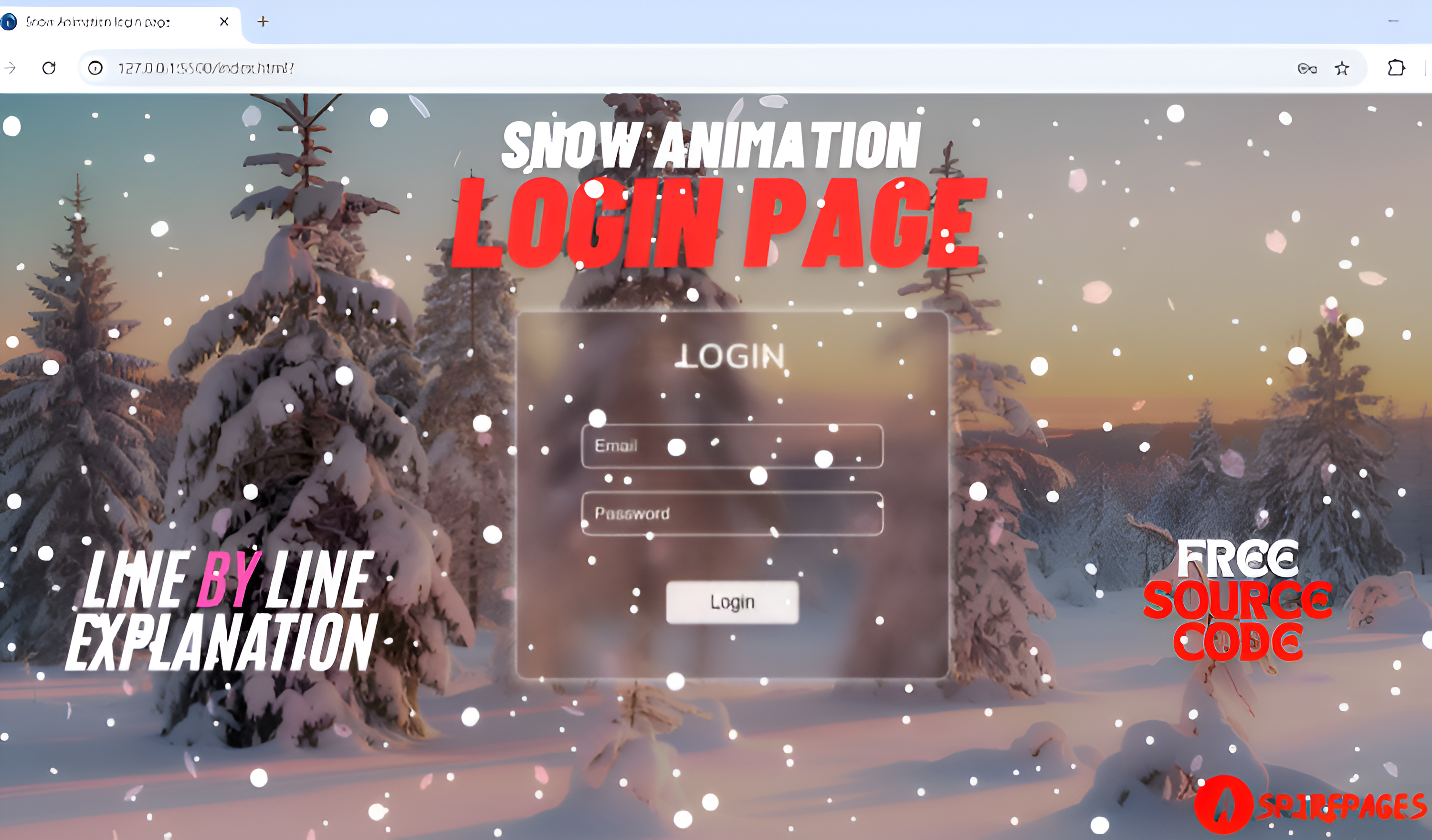
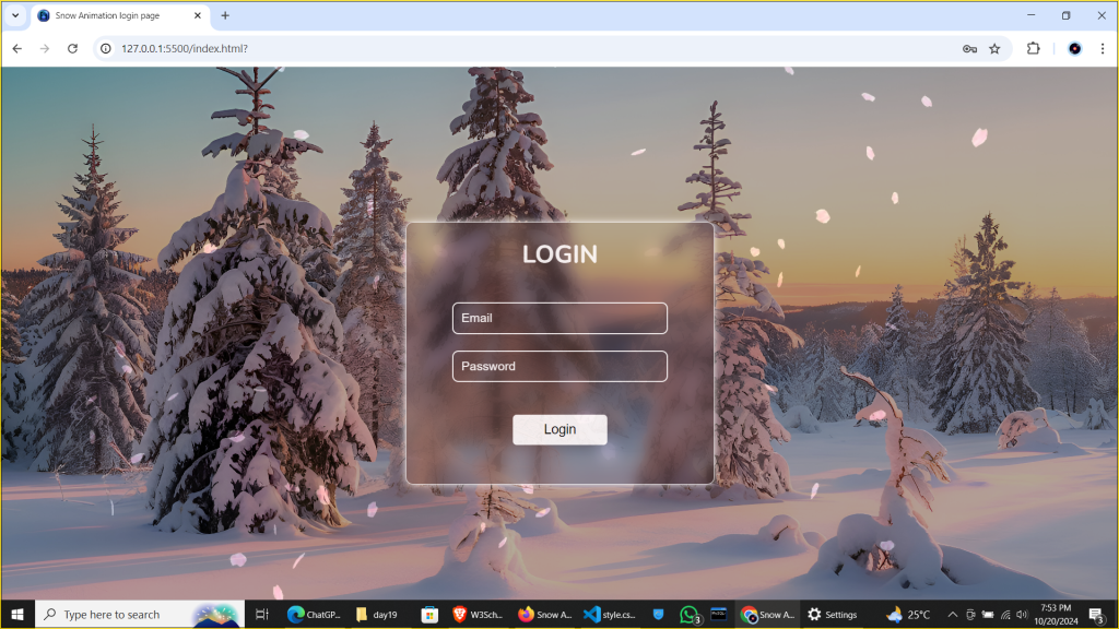
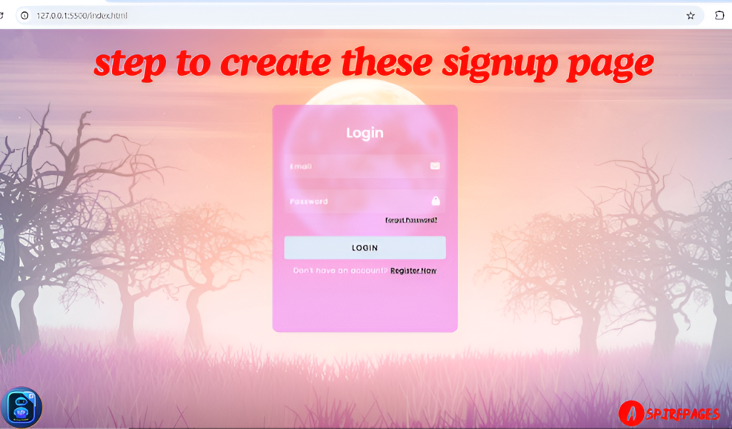
Looking to add a unique touch to your login page? Imagine a beautiful winter wonderland, with gentle snowflakes drifting in the background, instantly grabbing users’ attention. Adding subtle animations like snow can make your page feel dynamic, professional, and visually stunning, without compromising functionality or user experience.
In this blog post, I’ll guide you through creating a snow animation login page in just 3 simple steps using HTML and CSS. Whether you’re working on a holiday-themed website, an app with a playful design, or simply want to enhance your login page with a serene, animated background, this tutorial will show you how to achieve that.
And the best part? You won’t have to build it from scratch! You’ll get the complete source code for free, along with detailed, step-by-step explanations on how everything works. Plus, I’ll walk you through every piece of the code to ensure you understand how to tweak it to fit your project’s needs.
By the end of this post, you’ll not only have a functional, eye-catching login page but also learn some useful tips on styling forms and integrating animations that can be reused in future projects. Let’s get started!
[{"id":4135,"link":"https:\/\/aspirepages.in\/responsive-mega-menu-for-navbar\/","name":"responsive-mega-menu-for-navbar","thumbnail":{"url":"https:\/\/aspirepages.in\/wp-content\/uploads\/2025\/05\/Copy-of-Planet-Arcadia-1-1.png","alt":"\u2699\ufe0f Responsive mega menu built using HTML, CSS, and JS for navbar layout"},"title":"Create a Responsive Mega Menu for Navbar in Under 5 Mins: Simple Steps + Copy-and-Use Code Snippets (HTML, CSS, JS | Free Code + Full Tutorial)","author":{"name":"narenkumar","link":"https:\/\/aspirepages.in\/author\/narenkumar\/"},"date":"May 2, 2025","dateGMT":"2025-05-02 17:58:40","modifiedDate":"2025-05-02 17:58:44","modifiedDateGMT":"2025-05-02 17:58:44","commentCount":"0","commentStatus":"open","categories":{"coma":"<a href=\"https:\/\/aspirepages.in\/category\/codeing\/\" rel=\"category tag\">Codeing<\/a>, <a href=\"https:\/\/aspirepages.in\/category\/books\/\" rel=\"category tag\">BOOKS<\/a>, <a href=\"https:\/\/aspirepages.in\/category\/computer-electronics\/\" rel=\"category tag\">Computer & Electronics<\/a>, <a href=\"https:\/\/aspirepages.in\/category\/education\/\" rel=\"category tag\">Education<\/a>, <a href=\"https:\/\/aspirepages.in\/category\/jobs-education\/\" rel=\"category tag\">Jobs & Education<\/a>","space":"<a href=\"https:\/\/aspirepages.in\/category\/codeing\/\" rel=\"category tag\">Codeing<\/a> <a href=\"https:\/\/aspirepages.in\/category\/books\/\" rel=\"category tag\">BOOKS<\/a> <a href=\"https:\/\/aspirepages.in\/category\/computer-electronics\/\" rel=\"category tag\">Computer & Electronics<\/a> <a href=\"https:\/\/aspirepages.in\/category\/education\/\" rel=\"category tag\">Education<\/a> <a href=\"https:\/\/aspirepages.in\/category\/jobs-education\/\" rel=\"category tag\">Jobs & Education<\/a>"},"taxonomies":{"post_tag":""},"readTime":{"min":34,"sec":19},"status":"publish","excerpt":""},{"id":4120,"link":"https:\/\/aspirepages.in\/smooth-image-slider-tutorial\/","name":"smooth-image-slider-tutorial","thumbnail":{"url":"https:\/\/aspirepages.in\/wp-content\/uploads\/2025\/03\/smooth-slider.png","alt":"A responsive split-screen image slider with smooth mouse interaction, built using HTML, CSS, and JavaScript\u2014perfect for modern web design."},"title":"How to Create a Smooth Image Slider with Mouse Interaction in Less Than 5 Steps Using Pure HTML, CSS, and JavaScript (Free Code + Full Tutorial)","author":{"name":"narenkumar","link":"https:\/\/aspirepages.in\/author\/narenkumar\/"},"date":"Mar 18, 2025","dateGMT":"2025-03-18 14:44:45","modifiedDate":"2025-03-18 15:16:46","modifiedDateGMT":"2025-03-18 15:16:46","commentCount":"0","commentStatus":"open","categories":{"coma":"<a href=\"https:\/\/aspirepages.in\/category\/codeing\/\" rel=\"category tag\">Codeing<\/a>, <a href=\"https:\/\/aspirepages.in\/category\/books\/\" rel=\"category tag\">BOOKS<\/a>, <a href=\"https:\/\/aspirepages.in\/category\/computer-electronics\/\" rel=\"category tag\">Computer & Electronics<\/a>, <a href=\"https:\/\/aspirepages.in\/category\/education\/\" rel=\"category tag\">Education<\/a>, <a href=\"https:\/\/aspirepages.in\/category\/jobs-education\/\" rel=\"category tag\">Jobs & Education<\/a>","space":"<a href=\"https:\/\/aspirepages.in\/category\/codeing\/\" rel=\"category tag\">Codeing<\/a> <a href=\"https:\/\/aspirepages.in\/category\/books\/\" rel=\"category tag\">BOOKS<\/a> <a href=\"https:\/\/aspirepages.in\/category\/computer-electronics\/\" rel=\"category tag\">Computer & Electronics<\/a> <a href=\"https:\/\/aspirepages.in\/category\/education\/\" rel=\"category tag\">Education<\/a> <a href=\"https:\/\/aspirepages.in\/category\/jobs-education\/\" rel=\"category tag\">Jobs & Education<\/a>"},"taxonomies":{"post_tag":"<a href='https:\/\/aspirepages.in\/tag\/aspirepages\/' rel='post_tag'>aspirepages<\/a><a href='https:\/\/aspirepages.in\/tag\/creative-web-design\/' rel='post_tag'>Creative Web Design<\/a><a href='https:\/\/aspirepages.in\/tag\/frontend-project\/' rel='post_tag'>frontend project<\/a><a href='https:\/\/aspirepages.in\/tag\/html-card\/' rel='post_tag'>html card<\/a><a href='https:\/\/aspirepages.in\/tag\/html-css-javascript-tutorial\/' rel='post_tag'>HTML CSS JavaScript Tutorial<\/a><a href='https:\/\/aspirepages.in\/tag\/htmlcssjavascript\/' rel='post_tag'>HTMLCSSJavaScript<\/a><a href='https:\/\/aspirepages.in\/tag\/image-slider\/' rel='post_tag'>image slider<\/a><a href='https:\/\/aspirepages.in\/tag\/interactive-website-design\/' rel='post_tag'>Interactive Website Design<\/a><a href='https:\/\/aspirepages.in\/tag\/javascript-for-websites\/' rel='post_tag'>JavaScript for Websites<\/a><a href='https:\/\/aspirepages.in\/tag\/mouse-interaction-effect\/' rel='post_tag'>mouse interaction effect<\/a><a href='https:\/\/aspirepages.in\/tag\/responsivecardslider\/' rel='post_tag'>ResponsiveCardSlider<\/a><a href='https:\/\/aspirepages.in\/tag\/smooth-animation\/' rel='post_tag'>smooth animation<\/a><a href='https:\/\/aspirepages.in\/tag\/split-screen-slider\/' rel='post_tag'>split-screen slider<\/a>"},"readTime":{"min":6,"sec":37},"status":"publish","excerpt":""},{"id":4114,"link":"https:\/\/aspirepages.in\/responsive-card-slider-html-css-javascript\/","name":"responsive-card-slider-html-css-javascript","thumbnail":{"url":"https:\/\/aspirepages.in\/wp-content\/uploads\/2025\/03\/Responsive-Card-Slider.png","alt":"Responsive card slider created with HTML, CSS, and JavaScript, featuring smooth scrolling and touch-friendly controls for modern web design."},"title":"Create a Responsive Card Slider in Just 3 Simple Steps Using Pure HTML, CSS, and JavaScript (Free Source Code + Line-by-Line Explanation)","author":{"name":"narenkumar","link":"https:\/\/aspirepages.in\/author\/narenkumar\/"},"date":"Mar 16, 2025","dateGMT":"2025-03-16 18:11:09","modifiedDate":"2025-03-16 18:11:13","modifiedDateGMT":"2025-03-16 18:11:13","commentCount":"0","commentStatus":"open","categories":{"coma":"<a href=\"https:\/\/aspirepages.in\/category\/codeing\/\" rel=\"category tag\">Codeing<\/a>, <a href=\"https:\/\/aspirepages.in\/category\/books\/\" rel=\"category tag\">BOOKS<\/a>, <a href=\"https:\/\/aspirepages.in\/category\/computer-electronics\/\" rel=\"category tag\">Computer & Electronics<\/a>, <a href=\"https:\/\/aspirepages.in\/category\/education\/\" rel=\"category tag\">Education<\/a>, <a href=\"https:\/\/aspirepages.in\/category\/jobs-education\/\" rel=\"category tag\">Jobs & Education<\/a>","space":"<a href=\"https:\/\/aspirepages.in\/category\/codeing\/\" rel=\"category tag\">Codeing<\/a> <a href=\"https:\/\/aspirepages.in\/category\/books\/\" rel=\"category tag\">BOOKS<\/a> <a href=\"https:\/\/aspirepages.in\/category\/computer-electronics\/\" rel=\"category tag\">Computer & Electronics<\/a> <a href=\"https:\/\/aspirepages.in\/category\/education\/\" rel=\"category tag\">Education<\/a> <a href=\"https:\/\/aspirepages.in\/category\/jobs-education\/\" rel=\"category tag\">Jobs & Education<\/a>"},"taxonomies":{"post_tag":"<a href='https:\/\/aspirepages.in\/tag\/3d-website-effect\/' rel='post_tag'>3D Website Effect<\/a><a href='https:\/\/aspirepages.in\/tag\/aspirepages\/' rel='post_tag'>aspirepages<\/a><a href='https:\/\/aspirepages.in\/tag\/creative-web-design\/' rel='post_tag'>Creative Web Design<\/a><a href='https:\/\/aspirepages.in\/tag\/how-to-create-3d-effects\/' rel='post_tag'>How to Create 3D Effects<\/a><a href='https:\/\/aspirepages.in\/tag\/html-card\/' rel='post_tag'>html card<\/a><a href='https:\/\/aspirepages.in\/tag\/html-css-javascript-tutorial\/' rel='post_tag'>HTML CSS JavaScript Tutorial<\/a><a href='https:\/\/aspirepages.in\/tag\/htmlcssjavascript\/' rel='post_tag'>HTMLCSSJavaScript<\/a><a href='https:\/\/aspirepages.in\/tag\/interactive-website-design\/' rel='post_tag'>Interactive Website Design<\/a><a href='https:\/\/aspirepages.in\/tag\/javascript-for-websites\/' rel='post_tag'>JavaScript for Websites<\/a><a href='https:\/\/aspirepages.in\/tag\/responsivecardslider\/' rel='post_tag'>ResponsiveCardSlider<\/a><a href='https:\/\/aspirepages.in\/tag\/web-development-tutorial\/' rel='post_tag'>Web Development Tutorial<\/a>"},"readTime":{"min":9,"sec":34},"status":"publish","excerpt":""},{"id":4098,"link":"https:\/\/aspirepages.in\/mern-stack-data-flow-vite-react-nodejs-mongodb\/","name":"mern-stack-data-flow-vite-react-nodejs-mongodb","thumbnail":{"url":"https:\/\/aspirepages.in\/wp-content\/uploads\/2025\/03\/mernstack.png","alt":"MERN Stack Data Flow Explained (2025) \u2013 Connecting Vite React, Node.js, Express & MongoDB via REST API"},"title":"MERN Stack Data Flow Explained (2025): Essential Steps for MERN Stack Developers to Link Vite React, Node.js, Express & MongoDB Using REST API (Free Code & Line-by-Line Explanation)","author":{"name":"narenkumar","link":"https:\/\/aspirepages.in\/author\/narenkumar\/"},"date":"Mar 14, 2025","dateGMT":"2025-03-14 17:32:40","modifiedDate":"2025-03-14 17:32:45","modifiedDateGMT":"2025-03-14 17:32:45","commentCount":"0","commentStatus":"open","categories":{"coma":"<a href=\"https:\/\/aspirepages.in\/category\/codeing\/\" rel=\"category tag\">Codeing<\/a>, <a href=\"https:\/\/aspirepages.in\/category\/books\/\" rel=\"category tag\">BOOKS<\/a>, <a href=\"https:\/\/aspirepages.in\/category\/computer-electronics\/\" rel=\"category tag\">Computer & Electronics<\/a>, <a href=\"https:\/\/aspirepages.in\/category\/education\/\" rel=\"category tag\">Education<\/a>, <a href=\"https:\/\/aspirepages.in\/category\/jobs-education\/\" rel=\"category tag\">Jobs & Education<\/a>","space":"<a href=\"https:\/\/aspirepages.in\/category\/codeing\/\" rel=\"category tag\">Codeing<\/a> <a href=\"https:\/\/aspirepages.in\/category\/books\/\" rel=\"category tag\">BOOKS<\/a> <a href=\"https:\/\/aspirepages.in\/category\/computer-electronics\/\" rel=\"category tag\">Computer & Electronics<\/a> <a href=\"https:\/\/aspirepages.in\/category\/education\/\" rel=\"category tag\">Education<\/a> <a href=\"https:\/\/aspirepages.in\/category\/jobs-education\/\" rel=\"category tag\">Jobs & Education<\/a>"},"taxonomies":{"post_tag":"<a href='https:\/\/aspirepages.in\/tag\/frontend-backend-data-exchange\/' rel='post_tag'>Frontend Backend Data Exchange<\/a><a href='https:\/\/aspirepages.in\/tag\/mern-stack\/' rel='post_tag'>MERN stack<\/a><a href='https:\/\/aspirepages.in\/tag\/mern-stack-frontend-backend-communication\/' rel='post_tag'>MERN Stack Frontend Backend Communication<\/a><a href='https:\/\/aspirepages.in\/tag\/rest-api\/' rel='post_tag'>Rest API<\/a><a href='https:\/\/aspirepages.in\/tag\/vite-react\/' rel='post_tag'>Vite React<\/a>"},"readTime":{"min":11,"sec":36},"status":"publish","excerpt":""},{"id":4078,"link":"https:\/\/aspirepages.in\/3d-html-card-animation-guide\/","name":"3d-html-card-animation-guide","thumbnail":{"url":"https:\/\/aspirepages.in\/wp-content\/uploads\/2024\/11\/pixelcut-export-3.png","alt":"Ghost card animation with HTML and CSS displayed on a clean, modern website background"},"title":"HTML Card Animation: Create a Ghost Card Effect for Your Website in 3 Steps: Free Downloadable Source File and Step-by-Step Explanation :","author":{"name":"narenkumar","link":"https:\/\/aspirepages.in\/author\/narenkumar\/"},"date":"Nov 24, 2024","dateGMT":"2024-11-24 18:37:06","modifiedDate":"2024-11-24 18:37:12","modifiedDateGMT":"2024-11-24 18:37:12","commentCount":"0","commentStatus":"open","categories":{"coma":"<a href=\"https:\/\/aspirepages.in\/category\/codeing\/\" rel=\"category tag\">Codeing<\/a>, <a href=\"https:\/\/aspirepages.in\/category\/books\/\" rel=\"category tag\">BOOKS<\/a>, <a href=\"https:\/\/aspirepages.in\/category\/computer-electronics\/\" rel=\"category tag\">Computer & Electronics<\/a>, <a href=\"https:\/\/aspirepages.in\/category\/education\/\" rel=\"category tag\">Education<\/a>, <a href=\"https:\/\/aspirepages.in\/category\/jobs-education\/\" rel=\"category tag\">Jobs & Education<\/a>","space":"<a href=\"https:\/\/aspirepages.in\/category\/codeing\/\" rel=\"category tag\">Codeing<\/a> <a href=\"https:\/\/aspirepages.in\/category\/books\/\" rel=\"category tag\">BOOKS<\/a> <a href=\"https:\/\/aspirepages.in\/category\/computer-electronics\/\" rel=\"category tag\">Computer & Electronics<\/a> <a href=\"https:\/\/aspirepages.in\/category\/education\/\" rel=\"category tag\">Education<\/a> <a href=\"https:\/\/aspirepages.in\/category\/jobs-education\/\" rel=\"category tag\">Jobs & Education<\/a>"},"taxonomies":{"post_tag":"<a href='https:\/\/aspirepages.in\/tag\/3d-website-effect\/' rel='post_tag'>3D Website Effect<\/a><a href='https:\/\/aspirepages.in\/tag\/creative-web-design\/' rel='post_tag'>Creative Web Design<\/a><a href='https:\/\/aspirepages.in\/tag\/how-to-create-3d-effects\/' rel='post_tag'>How to Create 3D Effects<\/a><a href='https:\/\/aspirepages.in\/tag\/html-card\/' rel='post_tag'>html card<\/a><a href='https:\/\/aspirepages.in\/tag\/html-css-javascript-tutorial\/' rel='post_tag'>HTML CSS JavaScript Tutorial<\/a><a href='https:\/\/aspirepages.in\/tag\/interactive-website-design\/' rel='post_tag'>Interactive Website Design<\/a><a href='https:\/\/aspirepages.in\/tag\/javascript-for-websites\/' rel='post_tag'>JavaScript for Websites<\/a><a href='https:\/\/aspirepages.in\/tag\/web-development-tutorial\/' rel='post_tag'>Web Development Tutorial<\/a>"},"readTime":{"min":15,"sec":13},"status":"publish","excerpt":""},{"id":4065,"link":"https:\/\/aspirepages.in\/3d-pencil-drawing-website-tutorial\/","name":"3d-pencil-drawing-website-tutorial","thumbnail":{"url":"https:\/\/aspirepages.in\/wp-content\/uploads\/2024\/11\/final.png","alt":"3D pencil drawing effect on a website using HTML, CSS, and JavaScript"},"title":"5 Simple Steps to Build a 3D Pencil Drawing on Your Website: Complete Source Code & Guide","author":{"name":"narenkumar","link":"https:\/\/aspirepages.in\/author\/narenkumar\/"},"date":"Nov 7, 2024","dateGMT":"2024-11-07 18:38:38","modifiedDate":"2024-11-07 18:40:44","modifiedDateGMT":"2024-11-07 18:40:44","commentCount":"0","commentStatus":"open","categories":{"coma":"<a href=\"https:\/\/aspirepages.in\/category\/codeing\/\" rel=\"category tag\">Codeing<\/a>, <a href=\"https:\/\/aspirepages.in\/category\/books\/\" rel=\"category tag\">BOOKS<\/a>, <a href=\"https:\/\/aspirepages.in\/category\/computer-electronics\/\" rel=\"category tag\">Computer & Electronics<\/a>, <a href=\"https:\/\/aspirepages.in\/category\/education\/\" rel=\"category tag\">Education<\/a>, <a href=\"https:\/\/aspirepages.in\/category\/jobs-education\/\" rel=\"category tag\">Jobs & Education<\/a>","space":"<a href=\"https:\/\/aspirepages.in\/category\/codeing\/\" rel=\"category tag\">Codeing<\/a> <a href=\"https:\/\/aspirepages.in\/category\/books\/\" rel=\"category tag\">BOOKS<\/a> <a href=\"https:\/\/aspirepages.in\/category\/computer-electronics\/\" rel=\"category tag\">Computer & Electronics<\/a> <a href=\"https:\/\/aspirepages.in\/category\/education\/\" rel=\"category tag\">Education<\/a> <a href=\"https:\/\/aspirepages.in\/category\/jobs-education\/\" rel=\"category tag\">Jobs & Education<\/a>"},"taxonomies":{"post_tag":"<a href='https:\/\/aspirepages.in\/tag\/3d-pencil-drawing\/' rel='post_tag'>3D Pencil Drawing<\/a><a href='https:\/\/aspirepages.in\/tag\/3d-website-effect\/' rel='post_tag'>3D Website Effect<\/a><a href='https:\/\/aspirepages.in\/tag\/creative-web-design\/' rel='post_tag'>Creative Web Design<\/a><a href='https:\/\/aspirepages.in\/tag\/css-pencil-drawing-effect\/' rel='post_tag'>CSS Pencil Drawing Effect<\/a><a href='https:\/\/aspirepages.in\/tag\/how-to-create-3d-effects\/' rel='post_tag'>How to Create 3D Effects<\/a><a href='https:\/\/aspirepages.in\/tag\/html-css-javascript-tutorial\/' rel='post_tag'>HTML CSS JavaScript Tutorial<\/a><a href='https:\/\/aspirepages.in\/tag\/interactive-website-design\/' rel='post_tag'>Interactive Website Design<\/a><a href='https:\/\/aspirepages.in\/tag\/javascript-for-websites\/' rel='post_tag'>JavaScript for Websites<\/a><a href='https:\/\/aspirepages.in\/tag\/web-development-tutorial\/' rel='post_tag'>Web Development Tutorial<\/a>"},"readTime":{"min":12,"sec":1},"status":"publish","excerpt":""},{"id":4053,"link":"https:\/\/aspirepages.in\/css-gallery-animations-view-transitions\/","name":"css-gallery-animations-view-transitions","thumbnail":{"url":"https:\/\/aspirepages.in\/wp-content\/uploads\/2024\/10\/pixelcut-export-1.png","alt":"Animated CSS gallery with smooth view transitions for interactive, responsive design."},"title":"Create CSS Gallery Animations: 5 Easy Steps to Smooth View Transitions and Interactive Design \u2013 Full Source Code and Explanations","author":{"name":"narenkumar","link":"https:\/\/aspirepages.in\/author\/narenkumar\/"},"date":"Oct 25, 2024","dateGMT":"2024-10-25 18:40:57","modifiedDate":"2024-10-25 18:41:03","modifiedDateGMT":"2024-10-25 18:41:03","commentCount":"0","commentStatus":"open","categories":{"coma":"<a href=\"https:\/\/aspirepages.in\/category\/codeing\/\" rel=\"category tag\">Codeing<\/a>, <a href=\"https:\/\/aspirepages.in\/category\/books\/\" rel=\"category tag\">BOOKS<\/a>, <a href=\"https:\/\/aspirepages.in\/category\/computer-electronics\/\" rel=\"category tag\">Computer & Electronics<\/a>, <a href=\"https:\/\/aspirepages.in\/category\/education\/\" rel=\"category tag\">Education<\/a>, <a href=\"https:\/\/aspirepages.in\/category\/jobs-education\/\" rel=\"category tag\">Jobs & Education<\/a>","space":"<a href=\"https:\/\/aspirepages.in\/category\/codeing\/\" rel=\"category tag\">Codeing<\/a> <a href=\"https:\/\/aspirepages.in\/category\/books\/\" rel=\"category tag\">BOOKS<\/a> <a href=\"https:\/\/aspirepages.in\/category\/computer-electronics\/\" rel=\"category tag\">Computer & Electronics<\/a> <a href=\"https:\/\/aspirepages.in\/category\/education\/\" rel=\"category tag\">Education<\/a> <a href=\"https:\/\/aspirepages.in\/category\/jobs-education\/\" rel=\"category tag\">Jobs & Education<\/a>"},"taxonomies":{"post_tag":"<a href='https:\/\/aspirepages.in\/tag\/animation-techniques\/' rel='post_tag'>Animation Techniques<\/a><a href='https:\/\/aspirepages.in\/tag\/code-snippets\/' rel='post_tag'>Code Snippets<\/a><a href='https:\/\/aspirepages.in\/tag\/css-animations\/' rel='post_tag'>CSS Animations<\/a><a href='https:\/\/aspirepages.in\/tag\/full-source-code\/' rel='post_tag'>Full Source Code<\/a><a href='https:\/\/aspirepages.in\/tag\/interactive-web-design\/' rel='post_tag'>Interactive Web Design<\/a><a href='https:\/\/aspirepages.in\/tag\/modern-web-design\/' rel='post_tag'>Modern Web Design<\/a>"},"readTime":{"min":6,"sec":5},"status":"publish","excerpt":""},{"id":4027,"link":"https:\/\/aspirepages.in\/login-page-snow-animation-free-download-code\/","name":"login-page-snow-animation-free-download-code","thumbnail":{"url":"https:\/\/aspirepages.in\/wp-content\/uploads\/2024\/10\/final-1.png","alt":"snow login page"},"title":"Create a Snow Animation Login Page in 3 Steps: Free Downloadable Source File and with Step-by-Step Explanation","author":{"name":"narenkumar","link":"https:\/\/aspirepages.in\/author\/narenkumar\/"},"date":"Oct 20, 2024","dateGMT":"2024-10-20 16:13:26","modifiedDate":"2024-10-24 18:16:06","modifiedDateGMT":"2024-10-24 18:16:06","commentCount":"0","commentStatus":"open","categories":{"coma":"<a href=\"https:\/\/aspirepages.in\/category\/codeing\/\" rel=\"category tag\">Codeing<\/a>, <a href=\"https:\/\/aspirepages.in\/category\/books\/\" rel=\"category tag\">BOOKS<\/a>, <a href=\"https:\/\/aspirepages.in\/category\/computer-electronics\/\" rel=\"category tag\">Computer & Electronics<\/a>, <a href=\"https:\/\/aspirepages.in\/category\/education\/\" rel=\"category tag\">Education<\/a>, <a href=\"https:\/\/aspirepages.in\/category\/jobs-education\/\" rel=\"category tag\">Jobs & Education<\/a>","space":"<a href=\"https:\/\/aspirepages.in\/category\/codeing\/\" rel=\"category tag\">Codeing<\/a> <a href=\"https:\/\/aspirepages.in\/category\/books\/\" rel=\"category tag\">BOOKS<\/a> <a href=\"https:\/\/aspirepages.in\/category\/computer-electronics\/\" rel=\"category tag\">Computer & Electronics<\/a> <a href=\"https:\/\/aspirepages.in\/category\/education\/\" rel=\"category tag\">Education<\/a> <a href=\"https:\/\/aspirepages.in\/category\/jobs-education\/\" rel=\"category tag\">Jobs & Education<\/a>"},"taxonomies":{"post_tag":""},"readTime":{"min":6,"sec":16},"status":"publish","excerpt":""},{"id":4016,"link":"https:\/\/aspirepages.in\/build-interactive-scratch-card-html-css-js\/","name":"build-interactive-scratch-card-html-css-js","thumbnail":{"url":"https:\/\/aspirepages.in\/wp-content\/uploads\/2024\/10\/final.png","alt":"Interactive Scratch Card with Hidden Rewards Revealed on Scratch"},"title":"Build an Interactive Scratch Card for Your Website in 3 steps : Free Downloadable Source File and with Step-by-Step Explanation","author":{"name":"narenkumar","link":"https:\/\/aspirepages.in\/author\/narenkumar\/"},"date":"Oct 19, 2024","dateGMT":"2024-10-19 18:05:44","modifiedDate":"2024-10-20 17:08:32","modifiedDateGMT":"2024-10-20 17:08:32","commentCount":"0","commentStatus":"open","categories":{"coma":"<a href=\"https:\/\/aspirepages.in\/category\/codeing\/\" rel=\"category tag\">Codeing<\/a>, <a href=\"https:\/\/aspirepages.in\/category\/books\/\" rel=\"category tag\">BOOKS<\/a>, <a href=\"https:\/\/aspirepages.in\/category\/computer-electronics\/\" rel=\"category tag\">Computer & Electronics<\/a>, <a href=\"https:\/\/aspirepages.in\/category\/education\/\" rel=\"category tag\">Education<\/a>, <a href=\"https:\/\/aspirepages.in\/category\/jobs-education\/\" rel=\"category tag\">Jobs & Education<\/a>","space":"<a href=\"https:\/\/aspirepages.in\/category\/codeing\/\" rel=\"category tag\">Codeing<\/a> <a href=\"https:\/\/aspirepages.in\/category\/books\/\" rel=\"category tag\">BOOKS<\/a> <a href=\"https:\/\/aspirepages.in\/category\/computer-electronics\/\" rel=\"category tag\">Computer & Electronics<\/a> <a href=\"https:\/\/aspirepages.in\/category\/education\/\" rel=\"category tag\">Education<\/a> <a href=\"https:\/\/aspirepages.in\/category\/jobs-education\/\" rel=\"category tag\">Jobs & Education<\/a>"},"taxonomies":{"post_tag":""},"readTime":{"min":9,"sec":52},"status":"publish","excerpt":""},{"id":3974,"link":"https:\/\/aspirepages.in\/naughty-css-button\/","name":"naughty-css-button","thumbnail":{"url":"https:\/\/aspirepages.in\/wp-content\/uploads\/2024\/10\/Naughty-Submit-Button.png","alt":""},"title":"5 Easy Steps to Create a Naughty CSS Button: Full Source Code and Explanations","author":{"name":"narenkumar","link":"https:\/\/aspirepages.in\/author\/narenkumar\/"},"date":"Oct 17, 2024","dateGMT":"2024-10-17 14:39:30","modifiedDate":"2024-10-19 18:47:07","modifiedDateGMT":"2024-10-19 18:47:07","commentCount":"0","commentStatus":"open","categories":{"coma":"<a href=\"https:\/\/aspirepages.in\/category\/jobs-education\/\" rel=\"category tag\">Jobs & Education<\/a>, <a href=\"https:\/\/aspirepages.in\/category\/books\/\" rel=\"category tag\">BOOKS<\/a>, <a href=\"https:\/\/aspirepages.in\/category\/community\/\" rel=\"category tag\">Community<\/a>, <a href=\"https:\/\/aspirepages.in\/category\/computer-electronics\/\" rel=\"category tag\">Computer & Electronics<\/a>","space":"<a href=\"https:\/\/aspirepages.in\/category\/jobs-education\/\" rel=\"category tag\">Jobs & Education<\/a> <a href=\"https:\/\/aspirepages.in\/category\/books\/\" rel=\"category tag\">BOOKS<\/a> <a href=\"https:\/\/aspirepages.in\/category\/community\/\" rel=\"category tag\">Community<\/a> <a href=\"https:\/\/aspirepages.in\/category\/computer-electronics\/\" rel=\"category tag\">Computer & Electronics<\/a>"},"taxonomies":{"post_tag":""},"readTime":{"min":8,"sec":4},"status":"publish","excerpt":""},{"id":3939,"link":"https:\/\/aspirepages.in\/how-to-create-signup-page-guide\/","name":"how-to-create-signup-page-guide","thumbnail":{"url":"https:\/\/aspirepages.in\/wp-content\/uploads\/2024\/09\/pixelcut-export-2.png","alt":"signup page"},"title":"Creating a Stylish\/Trending Signup Page[1]: Complete Guide with HTML, CSS, and JavaScript:","author":{"name":"narenkumar","link":"https:\/\/aspirepages.in\/author\/narenkumar\/"},"date":"Sep 23, 2024","dateGMT":"2024-09-23 18:02:36","modifiedDate":"2024-11-26 10:30:32","modifiedDateGMT":"2024-11-26 10:30:32","commentCount":"0","commentStatus":"open","categories":{"coma":"<a href=\"https:\/\/aspirepages.in\/category\/codeing\/\" rel=\"category tag\">Codeing<\/a>, <a href=\"https:\/\/aspirepages.in\/category\/books\/\" rel=\"category tag\">BOOKS<\/a>, <a href=\"https:\/\/aspirepages.in\/category\/education\/\" rel=\"category tag\">Education<\/a>, <a href=\"https:\/\/aspirepages.in\/category\/jobs-education\/\" rel=\"category tag\">Jobs & Education<\/a>, <a href=\"https:\/\/aspirepages.in\/category\/technology\/\" rel=\"category tag\">Technology<\/a>","space":"<a href=\"https:\/\/aspirepages.in\/category\/codeing\/\" rel=\"category tag\">Codeing<\/a> <a href=\"https:\/\/aspirepages.in\/category\/books\/\" rel=\"category tag\">BOOKS<\/a> <a href=\"https:\/\/aspirepages.in\/category\/education\/\" rel=\"category tag\">Education<\/a> <a href=\"https:\/\/aspirepages.in\/category\/jobs-education\/\" rel=\"category tag\">Jobs & Education<\/a> <a href=\"https:\/\/aspirepages.in\/category\/technology\/\" rel=\"category tag\">Technology<\/a>"},"taxonomies":{"post_tag":""},"readTime":{"min":9,"sec":18},"status":"publish","excerpt":""},{"id":3922,"link":"https:\/\/aspirepages.in\/build-a-day-night-mode-toggle-button-6-applications-with-complete-code-and-line-by-line-explanations\/","name":"build-a-day-night-mode-toggle-button-6-applications-with-complete-code-and-line-by-line-explanations","thumbnail":{"url":"https:\/\/aspirepages.in\/wp-content\/uploads\/2024\/09\/pixelcut-export.png","alt":"Day-Night Mode"},"title":"Build a Day-Night Mode Toggle Button: 3 Applications with Complete Code and Line-by-Line Explanations","author":{"name":"narenkumar","link":"https:\/\/aspirepages.in\/author\/narenkumar\/"},"date":"Sep 21, 2024","dateGMT":"2024-09-21 07:22:08","modifiedDate":"2024-09-23 18:08:31","modifiedDateGMT":"2024-09-23 18:08:31","commentCount":"1","commentStatus":"open","categories":{"coma":"<a href=\"https:\/\/aspirepages.in\/category\/codeing\/\" rel=\"category tag\">Codeing<\/a>, <a href=\"https:\/\/aspirepages.in\/category\/books\/\" rel=\"category tag\">BOOKS<\/a>, <a href=\"https:\/\/aspirepages.in\/category\/education\/\" rel=\"category tag\">Education<\/a>","space":"<a href=\"https:\/\/aspirepages.in\/category\/codeing\/\" rel=\"category tag\">Codeing<\/a> <a href=\"https:\/\/aspirepages.in\/category\/books\/\" rel=\"category tag\">BOOKS<\/a> <a href=\"https:\/\/aspirepages.in\/category\/education\/\" rel=\"category tag\">Education<\/a>"},"taxonomies":{"post_tag":""},"readTime":{"min":3,"sec":58},"status":"publish","excerpt":""}]