Table of Contents
Introduction :
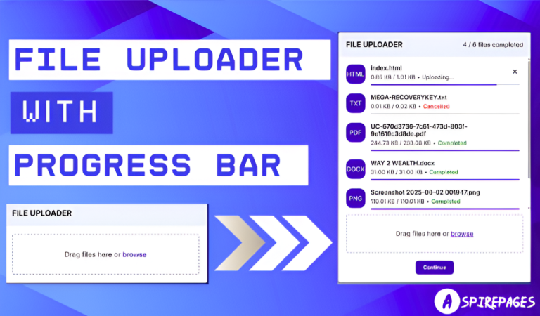
Creating a smooth and responsive file uploader with progress bar is easier than you think — even for beginners. If you’ve ever wanted to build a drag-and-drop file uploader with real-time bar progression, cancel options, and status updates like “Completed” or “Failed,” this tutorial is made for you. 🙌
In this beginner-friendly guide, we’ll walk through every step using HTML, CSS, and JavaScript to build a fully working, real-world component. You’ll get:
✅ Free source code
✅ Line-by-line explanation
✅ A responsive UI ready for any front-end project
Whether you’re building a portfolio or learning UI/UX patterns, this progress bar file uploader is a must-have for your toolkit.
Setup and Requirements For File Uploader with Progress Bar:
Before we begin, ensure you have the following:
✅ Requirements:
- A code editor like Visual Studio Code
- Basic knowledge of HTML, CSS, and JavaScript
- A modern web browser (Chrome, Firefox, Edge)
- No additional libraries or frameworks needed
⏱️ Time Required: Under 10 minutes to build!
📂 Folder Structure:
Create a project folder and set up the following files:
file-uploader-progress-bar/
│── index.html  (HTML structure)
│── index.css  (CSS for styling)
│── script.js   ( needed)
Now, let’s dive into building the file uploader with progress bar step by step!
Project Overview:
This project is a drag-and-drop file uploader with smooth progress bar built entirely with HTML, CSS, and JavaScript. Here’s what it includes:
Multiple file upload support
📥 Drag & drop or manual selection
📊 Animated bar progression
✅ Upload status indicators: “In Progress”, “Completed”, or “Failed”
❌ Cancel button for active uploads
Fully responsive design that adapts to all screen sizes
Whether you’re practicing JavaScript or enhancing a form interface, this uploader is sleek, simple, and scalable for real projects like File Uploader with Progress Bar.
This project is perfect for beginners to practice layout techniques, responsive design, and JavaScript event handling.
Step 1: HTML For File Uploader with Progress Bar:
HTML Code
<!DOCTYPE html>
<html lang="en">
  <head>
    <meta charset="UTF-8" />
    <meta name="viewport" content="width=device-width, initial-scale=1.0"/>
    <title>File Uploader | Aspirepages </title>
    <link rel="stylesheet" href="index.css" />
    <link rel="stylesheet" href="https://unpkg.com/boxicons@2.1.4/css/boxicons.min.css"/>
    <script src="script.js" defer></script>
  </head>
  <body>
    <div class="file-uploader">
      <div class="uploader-header">
        <h2 class="uploader-title">File Uploader</h2>
        <h4 class="file-completed-status"></h4>
      </div>
      <ul class="file-list"></ul>
      <div class="file-upload-box">
        <h2 class="box-title">
          <span class="file-instruction">Drag files here or</span>
          <span class="file-browse-button">browse</span>
        </h2>
        <input class="file-browse-input" type="file" multiple hidden>
      </div>
      <button id="continueButton"  class="continueButton">Continue</button>
    </div>
  </body>
</html>
HTML Explanation For File Uploader with Progress Bar:
<!DOCTYPE html> and <html lang="en">
The <!DOCTYPE html> declaration defines the document type as HTML5, ensuring modern browser rendering. The <html lang="en"> tag is the root of the document and specifies the page language as English, important for accessibility and SEO.
<head> Section: Metadata and Resources
The <head> contains essential meta tags and resource links. <meta charset="UTF-8" /> sets the character encoding to UTF-8, supporting all characters. <meta name="viewport" content="width=device-width, initial-scale=1.0"/> ensures the page is responsive on all devices by setting the viewport width to device width.
Title and Stylesheets
<title>File Uploader | Aspirepages </title> defines the browser tab title, aiding SEO and user navigation. The two <link> tags import CSS: index.css for custom styles and Boxicons library for icon fonts, enhancing UI visuals.
JavaScript Inclusion
<script src="script.js" defer></script> loads the JavaScript file asynchronously, deferring execution until HTML parsing completes, improving page load speed and ensuring scripts don’t block content rendering.
<body> and Main Container
The <body> contains visible page content. Inside it, <div class="file-uploader"> acts as the main wrapper for the entire file upload interface, grouping all related UI elements logically.
Uploader Header: Title and Status
Within the uploader, <div class="uploader-header"> holds the component’s title <h2 class="uploader-title">File Uploader</h2> and an empty status tag <h4 class="file-completed-status"></h4> which will dynamically display upload progress or completion messages.
File List Container
<ul class="file-list"></ul> is an empty unordered list that will populate with files added by the user, showing each file’s upload status or allowing interaction like cancel or retry.
Drag and Drop Upload Box
<div class="file-upload-box"> wraps the drag-and-drop area and browse button. Inside, <h2 class="box-title"> displays user instructions with two spans: one for drag instruction (Drag files here or) and one styled as a clickable browse button (browse).
Hidden File Input
<input class="file-browse-input" type="file" multiple hidden> is a hidden input element allowing multiple file selection. It’s triggered when users click the “browse” span, keeping UI clean while supporting file selection.
Continue Button
Finally, <button id="continueButton" class="continueButton">Continue</button> provides a call-to-action for users to proceed once files are selected or uploaded, making the workflow clear and actionable.
Closing Tags
The closing tags </div>, </body>, and </html> properly close all opened containers and complete the HTML document structure, ensuring well-formed markup for browsers to parse and display correctly.
Step 2 : CSS For File Uploader with Progress Bar:
CSS Code For File Uploader with Progress Bar
@import url('https://fonts.googleapis.com/css2?family=Inter:wght@100..900&display=swap');

* {
  margin: 0;
  padding: 0;
  box-sizing: border-box;
  font-family: "Inter", sans-serif;
}

body {
  display: flex;
  align-items: center;
  padding: 15px;
  justify-content: center;
  min-height: 100vh;
  background: linear-gradient(53deg, #fff 0%, #090979 63%);
}

.file-uploader {
  width: 500px;
  background: #fff;
  border-radius: 5px;
  box-shadow: 0 10px 20px rgba(0, 0, 0, 0.1);
}

.uploader-header {
  display: flex;
  padding: 20px;
  background: #EEF1FB;
  align-items: center;
  border-radius: 5px 5px 0 0;
  justify-content: space-between;
}

.uploader-title {
  font-size: 1.2rem;
  font-weight: 700;
  text-transform: uppercase;
}

.file-completed-status {
  font-size: 1rem;
  font-weight: 500;
  color: #333;
}

.file-list {
  list-style: none;
  width: 100%;
  padding-bottom: 10px;
  max-height: 400px;
  overflow-y: auto;
  scrollbar-color: #999 transparent;
  scrollbar-width: thin;
}

.file-list:has(li) {
  padding: 20px;
}

.file-item {
  display: flex;
  gap: 14px;
  margin-bottom: 22px;
}

.file-item:last-child {
  margin-bottom: 0px;
}

.file-extension {
  height: 50px;
  width: 50px;
  color: #fff;
  display: flex;
  text-transform: uppercase;
  align-items: center;
  justify-content: center;
  border-radius: 15px;
  background: #3d00c0;
}

.file-content-wrapper {
  flex: 1;
}

.file-content {
  display: flex;
  width: 100%;
  justify-content: space-between;
}

.file-name {
  font-size: 1rem;
  font-weight: 600;
}

.file-info {
  display: flex;
  gap: 5px;
}

.file-info small {
  color: #5c5c5c;
  margin-top: 5px;
  display: block;
  font-size: 0.9rem;
  font-weight: 500;
}

.file-status {
  color: #3d00c0;
}

.cancel-button {
  align-self: center;
  border: none;
  outline: none;
  background: none;
  cursor: pointer;
  font-size: 1.4rem;
}

.cancel-button:hover {
  color: #E3413F;
}

.file-progress-bar {
  width: 100%;
  height: 3px;
  margin-top: 10px;
  border-radius: 30px;
  background: #d9d9d9;
}

.file-progress {
  width: 0%;
  height: inherit;
  border-radius: inherit;
  background: #3d00c0;
}

.continueButton {
  display: none;
  margin: 20px auto;
  padding: 10px 20px;
  background: #3d00c0;
  color: white;
  border: none;
  border-radius: 8px;
  font-weight: bold;
  cursor: pointer;
}
.continueButton:hover {
  background: #290080;
}

.file-upload-box {
  margin: 10px 20px 20px;
  border-radius: 5px;
  min-height: 100px;
  display: flex;
  align-items: center;
  justify-content: center;
  border: 2px dashed #B1ADD4;
  transition: all 0.2s ease;
}

.file-upload-box.active {
  border: 2px solid #3d00c0;
  background: #F3F6FF;
}

.box-title {
  font-size: 1.05rem;
  font-weight: 500;
  color: #626161;
}

.file-browse-button {
  color: #3d00c0;
  cursor: pointer;
}
.file-browse-button:hover {
  text-decoration: underline;
}
CSS Explanation For File Uploader with Progress Bar:
@import url('https://fonts.googleapis.com/css2?family=Inter:wght@100..900&display=swap'); and Universal Selector
This line imports the “Inter” font family from Google Fonts with weights from 100 to 900 for versatile typography. The universal selector * resets margin and padding to zero, applies box-sizing: border-box for predictable sizing, and sets the font family globally to “Inter,” ensuring consistent styling across all elements.
body Styling
The body uses flexbox to center content both vertically and horizontally with align-items: center and justify-content: center. It adds padding: 15px for spacing and sets a minimum height to fill the viewport (100vh). The background is a smooth diagonal gradient from white to deep blue for a modern, eye-catching look.
.file-uploader Container
This class defines the main file uploader box with a fixed width of 500px, white background, rounded corners (border-radius: 5px), and a subtle shadow for depth, making it stand out from the background.
.uploader-header Layout
The uploader header uses flexbox to arrange its content with space between (justify-content: space-between) and vertically centered (align-items: center). It has padding and a light blue background for separation and a rounded top border matching the container for a polished look.
.uploader-title and .file-completed-status Text Styling
.uploader-title uses uppercase text, bold weight, and a medium font size for emphasis. .file-completed-status has a slightly smaller font size, moderate weight, and dark gray color for status messages, maintaining readability without overpowering the title.
.file-list Scrollable Area
This unordered list removes default bullet styling and sets width to 100%. It includes bottom padding and a max height of 400px with vertical scrolling (overflow-y: auto) for handling many files. The scrollbar is styled thin with subtle colors for a clean look. The :has(li) selector adds padding only when list items exist, preventing unnecessary space.
.file-item Flex Layout and Spacing
Each file item is displayed as a flex container with a 14px gap between elements and 22px margin below for spacing. The last file item removes bottom margin to avoid extra space at the end.
.file-extension Icon Style
This square box (50px) displays the file extension in uppercase, centered with flexbox. It has a purple background, white text, and rounded corners for a badge-like appearance, visually distinguishing file types.
.file-content-wrapper and .file-content Flexbox
The wrapper takes up remaining space (flex: 1). Inside, .file-content distributes the file name and status evenly with space between, making the UI balanced and readable.
.file-name and .file-info Text Styling
The file name uses a medium font size and bold weight for clarity. .file-info uses flexbox with a small gap to layout file details such as size or time, with a muted color and smaller font to keep focus on the filename.
.file-status Color Highlight
The status text is purple (#3d00c0), matching the theme and drawing attention to file progress or messages.
.cancel-button Interaction Style
The cancel button removes default styling for a clean icon-only button. The cursor changes to pointer on hover, and the color changes to red (#E3413F) to visually warn users about cancellation.
Progress Bar Styling
.file-progress-bar is a thin, rounded container with light gray background. The .file-progress inside it starts at 0% width and fills horizontally in purple as upload progresses, inheriting the bar’s rounded corners.
.continueButton Style
Initially hidden (display: none), it centers itself with margin, has purple background, white bold text, rounded corners, and a pointer cursor. On hover, the background darkens for clear interactive feedback.
.file-upload-box Drag-and-Drop Area
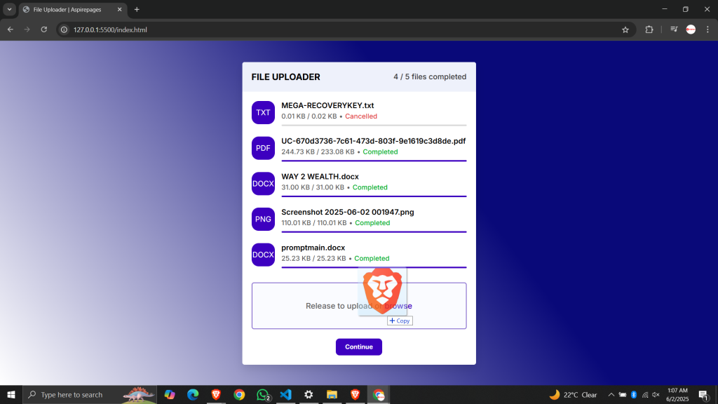
This box uses dashed borders, padding, and flexbox to center its instruction text vertically and horizontally. It includes smooth transitions for border and background changes on activation, enhancing user experience.
.file-upload-box.active State
When active (e.g., dragging files over), the border color changes to solid purple and background to light blue for a clear visual cue.
.box-title and .file-browse-button Text Styles
.box-title uses medium font size and weight with muted gray text for instructions. .file-browse-button is purple and changes to underlined on hover, indicating it’s clickable for browsing files.
This CSS provides a clean, modern, and fully responsive UI that supports the smooth drag-and-drop file uploader with a progress bar and user interaction feedback.
Step 3 : JavaScript For File Uploader with Progress Bar :
JavaScript Code For File Uploader with Progress Bar
const fileList = document.querySelector(".file-list");
const fileBrowseButton = document.querySelector(".file-browse-button");
const fileBrowseInput = document.querySelector(".file-browse-input");
const fileUploadBox = document.querySelector(".file-upload-box");
const fileCompletedStatus = document.querySelector(".file-completed-status");
const continueButton = document.getElementById("continueButton");

let totalFiles = 0;
let completedFiles = 0;

const createFileItemHTML = (file, uniqueIdentifier) => {
  const { name, size } = file;
  const extension = name.split(".").pop();
  const formattedSize = size >= 1024 * 1024
    ? `${(size / (1024 * 1024)).toFixed(2)} MB`
    : `${(size / 1024).toFixed(2)} KB`;

  return `
    <li class="file-item" id="file-item-${uniqueIdentifier}">
      <div class="file-extension">${extension}</div>
      <div class="file-content-wrapper">
        <div class="file-content">
          <div class="file-details">
            <h5 class="file-name">${name}</h5>
            <div class="file-info">
              <small class="file-size">0 / ${formattedSize}</small>
              <small class="file-divider">•</small>
              <small class="file-status">Uploading...</small>
            </div>
          </div>
          <button class="cancel-button"><i class='bx bx-x'></i></button>
        </div>
        <div class="file-progress-bar">
          <div class="file-progress"></div>
        </div>
      </div>
    </li>`;
};

const handleFileUploading = (file, id) => {
  const fakeXHR = {};
  const item = document.querySelector(`#file-item-${id}`);
  const progressBar = item.querySelector(".file-progress");
  const sizeText = item.querySelector(".file-size");
  const cancelBtn = item.querySelector(".cancel-button");
  const status = item.querySelector(".file-status");

  let uploaded = 0;
  const total = file.size;

  const interval = setInterval(() => {
    if (uploaded < total) {
      uploaded += total / 20;
      const percent = Math.min((uploaded / total) * 100, 100);
      const uploadedText = total >= 1024 * 1024
        ? `${(uploaded / (1024 * 1024)).toFixed(2)} MB / ${(total / (1024 * 1024)).toFixed(2)} MB`
        : `${(uploaded / 1024).toFixed(2)} KB / ${(total / 1024).toFixed(2)} KB`;

      progressBar.style.width = `${percent}%`;
      sizeText.innerText = uploadedText;
    } else {
      clearInterval(interval);
      status.innerText = "Completed";
      status.style.color = "#00B125";
      cancelBtn.remove();
      completedFiles++;
      fileCompletedStatus.innerText = `${completedFiles} / ${totalFiles} files completed`;
      checkIfAllFilesCompleted();
    }
  }, 100);

  fakeXHR.abort = () => {
    clearInterval(interval);
    progressBar.style.width = "0%";
    status.innerText = "Cancelled";
    status.style.color = "#E3413F";
    cancelBtn.remove();
  };

  cancelBtn.addEventListener("click", () => fakeXHR.abort());

  return fakeXHR;
};

const handleSelectedFiles = (files) => {
  if (files.length === 0) return;
  totalFiles += files.length;

  [...files].forEach((file, i) => {
    const id = Date.now() + i;
    fileList.insertAdjacentHTML("afterbegin", createFileItemHTML(file, id));
    handleFileUploading(file, id);
  });

  fileCompletedStatus.innerText = `${completedFiles} / ${totalFiles} files completed`;
};

function checkIfAllFilesCompleted() {
  if (completedFiles === totalFiles && totalFiles > 0) {
    continueButton.style.display = "block";
  }
}

fileUploadBox.addEventListener("drop", (e) => {
  e.preventDefault();
  fileUploadBox.classList.remove("active");
  fileUploadBox.querySelector(".file-instruction").innerText = "Drag files here or";
  handleSelectedFiles(e.dataTransfer.files);
});

fileUploadBox.addEventListener("dragover", (e) => {
  e.preventDefault();
  fileUploadBox.classList.add("active");
  fileUploadBox.querySelector(".file-instruction").innerText = "Release to upload or";
});

fileUploadBox.addEventListener("dragleave", (e) => {
  e.preventDefault();
  fileUploadBox.classList.remove("active");
  fileUploadBox.querySelector(".file-instruction").innerText = "Drag files here or";
});

fileBrowseButton.addEventListener("click", () => fileBrowseInput.click());
fileBrowseInput.addEventListener("change", (e) => handleSelectedFiles(e.target.files));


continueButton.addEventListener("click", () => {
  alert("All files uploaded!");
});
JavaScript Explantion For File Uploader with Progress Bar
Query Selectors and Initial Variables
The code starts by selecting important DOM elements: file list container, browse button, hidden file input, upload box, status display, and the continue button. It also initializes counters totalFiles and completedFiles to track upload progress.
createFileItemHTML Function
This function generates the HTML markup for each file added. It extracts the file name and size, formats the size into KB or MB, and creates a list item with the file extension, name, size, upload status, progress bar, and a cancel button.
handleFileUploading Function
This simulates the file upload process using setInterval. It gradually increases the uploaded amount and updates the progress bar width and size text every 100ms. On completion, it updates the status to “Completed”, removes the cancel button, increments the completed count, updates the overall status text, and checks if all uploads are done. It also defines an abort method to cancel the upload, resetting the UI and status.
Cancel Button Event
The cancel button inside each file item calls the abort method to stop the upload simulation, reset progress, update status to “Cancelled”, change color to red, and remove the button from the UI.
handleSelectedFiles Function
This handles files selected either by drag-and-drop or file browsing. It updates the total files count, adds each file’s HTML to the list, and starts uploading simulation for each. It also updates the overall completed files status display.
checkIfAllFilesCompleted Function
This function checks if the number of completed files equals the total files selected. If true, it reveals the “Continue” button by changing its CSS display property.
Drag-and-Drop Event Listeners
drop: Prevents default behavior, removes active styling, resets instruction text, and processes dropped files.dragover: Prevents default and adds active styling to indicate drag zone is ready. Changes instruction text accordingly.dragleave: Removes active styling and resets instruction text when dragged files leave the upload box area.
File Browse Button & Input Listeners
Clicking the visible browse button programmatically triggers a click on the hidden file input. When files are selected via this input, it calls handleSelectedFiles to process and start upload simulation.
Continue Button Click
When clicked after all uploads complete, it simply alerts the user with a confirmation message “All files uploaded!” indicating successful completion.
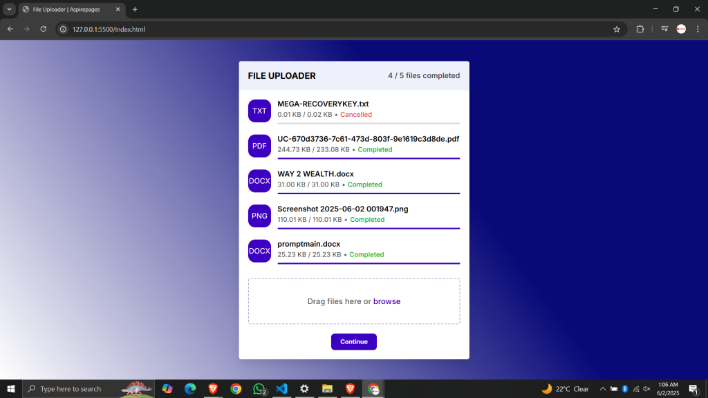
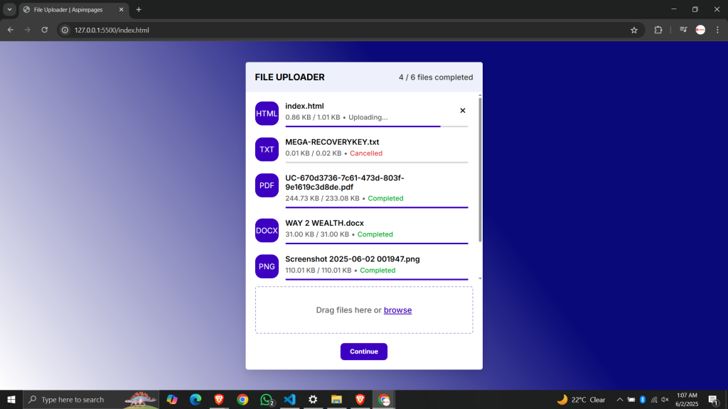
Live Preview The Demo Website:

Download complete code :
Git Hub link :

Conclusion :
You just built a fully functional file uploader with a smooth progress bar and bar progression using pure HTML, CSS, and JavaScript — great job! 🎉
💬 Got stuck somewhere? Drop your questions in the comments.
📲 Want more free tutorials like this? Follow us on Telegram or Instagram.
🔗 Check out more JavaScript UI Projects or Frontend Tools
Read our previous blog post :