Table of Contents
Introduction:
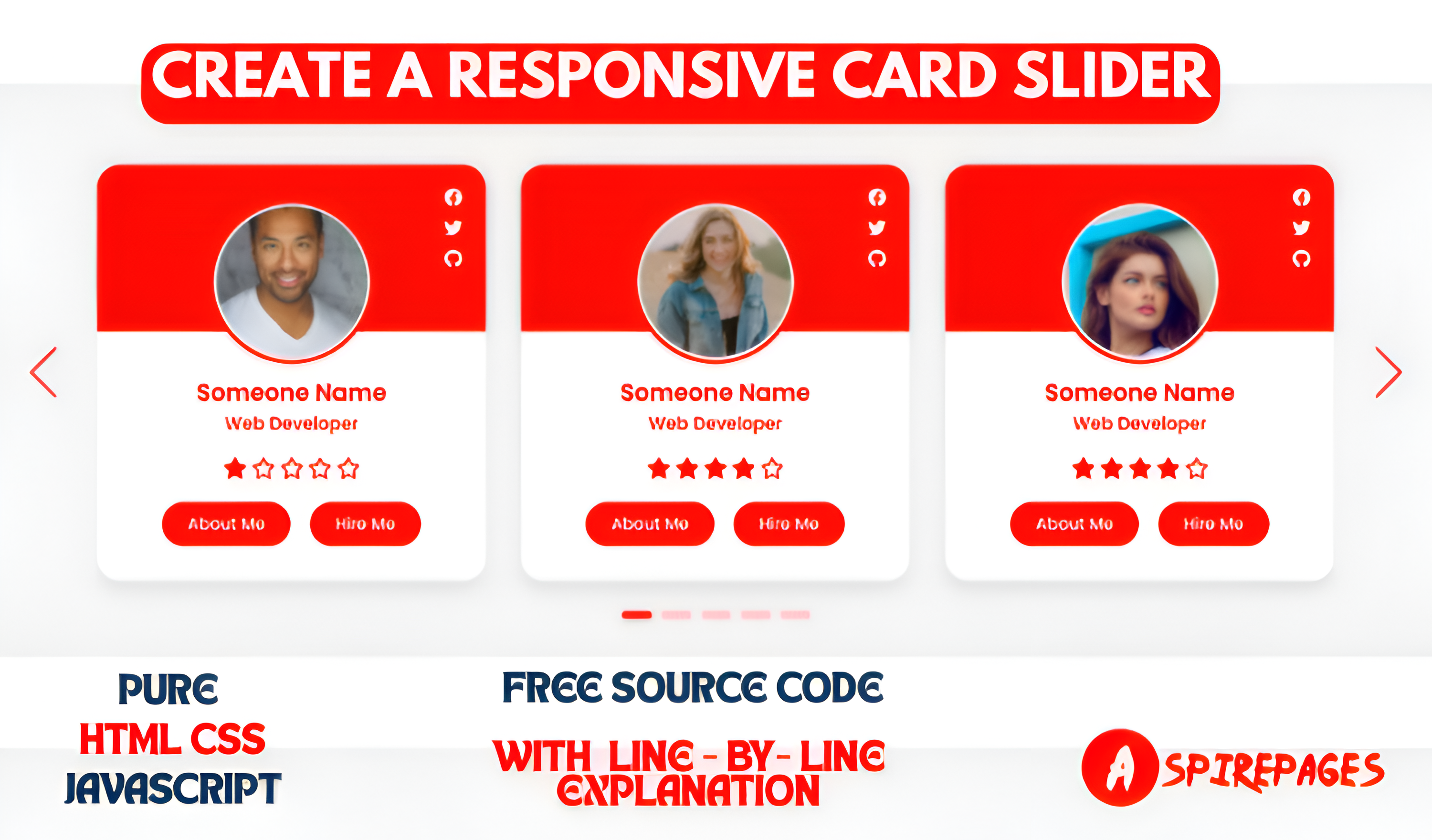
A responsive card slider is a great way to display multiple items in a user-friendly and interactive manner. Whether you’re showcasing products, testimonials, or featured content, a smooth slider enhances the UI/UX of your website.
In this tutorial, we will build a fully responsive card slider using HTML, CSS, and JavaScript in just 3 simple steps. By the end, you’ll have a sleek and interactive card slider with complete source code and a detailed explanation of every line.
Setup and Requirements For Responsive Card Slider:
Before we begin, ensure you have the following:
✅ Requirements:
- A basic understanding of HTML, CSS, and JavaScript.
- A code editor like VS Code, Sublime Text, or Atom.
- A modern web browser (Chrome, Firefox, Edge, etc.).
- Basic knowledge of flexbox for styling.
📂 Folder Structure:
Create a project folder and set up the following files:
responsive-card-slider/
│── index.html  (HTML structure)
│── index.css  (CSS for styling)
│── script.js   (not needed)
Now, let’s dive into building the card slider step by step!
Project Overview:
Let’s take a look at what we’ll be building in this project:
User-Customized GUI Controls: Incorporate dat.GUI to enable users to adjust animation properties, such as the intensity of the glowing effects or the rotation speed of the card.
Dark-Themed 3D HTML Animated Card: Create an interactive Ghost Rider-themed HTML card animation that features a mysterious glow and sleek modern design.
Three.js for 3D Rendering: Use Three.js to seamlessly render 3D elements and add stunning effects to the HTML card.
Visual Enhancements: Add dynamic bloom effects to make the HTML card glow, highlighting the 3D features and enhancing its visual appeal.
By the end of this project, you’ll have a fully functional, interactive Responsive Card Slider animation that will captivate users and provide you with a deeper understanding for real-world applications.
Step1: HTML For Responsive Card Slider:
HTML Code
<!DOCTYPE html>
<html lang="en">
  <head>
    <meta charset="UTF-8" />
    <meta name="viewport" content="width=device-width, initial-scale=1.0" />
    <title>Card  Slider | responsive </title>
    <!-- ===== Link Swiper's CSS ===== -->
    <link rel="stylesheet" href="https://unpkg.com/swiper/swiper-bundle.min.css" />
    <!-- ===== Fontawesome CDN Link ===== -->
    <link rel="stylesheet" href="https://cdnjs.cloudflare.com/ajax/libs/font-awesome/6.0.0-beta3/css/all.min.css" />
    <link rel="shortcut icon" href="./images/final upscale.png" type="image/x-icon">
    <!-- ===== CSS ===== -->
    <link rel="stylesheet" href="./index.css" />
  </head>
  <body>


    <section>

      <!-- Swiper container -->
      <div class="swiper mySwiper container">
        <div class="swiper-wrapper content">

          <!-- Swiper slide item 1 -->
          <div class="swiper-slide card">
            <div class="card-content">
              <!-- Profile image -->
              <div class="image">
                <img src="images/1.avif" alt="Profile Image 1" />
              </div>

              <!-- Social media icons -->
              <div class="media-icons">
                <i class="fab fa-facebook"></i>
                <i class="fab fa-twitter"></i>
                <i class="fab fa-github"></i>
              </div>

              <!-- Name and profession -->
              <div class="name-profession">
                <span class="name">Someone Name</span>
                <span class="profession">Web Developer</span>
              </div>

              <!-- Rating -->
              <div class="rating">
                <i class="fas fa-star"></i>
                <i class="far fa-star"></i>
                <i class="far fa-star"></i>
                <i class="far fa-star"></i>
                <i class="far fa-star"></i>
              </div>

              <!-- Buttons -->
              <div class="button">
                <button class="aboutMe">About Me</button>
                <button class="hireMe">Hire Me</button>
              </div>
            </div>
          </div>

          <!-- Swiper slide item 2 -->
          <div class="swiper-slide card">
            <div class="card-content">
              <!-- Profile image -->
              <div class="image">
                <img src="images/2.avif" alt="Profile Image 2" />
              </div>

              <!-- Social media icons -->
              <div class="media-icons">
                <i class="fab fa-facebook"></i>
                <i class="fab fa-twitter"></i>
                <i class="fab fa-github"></i>
              </div>

              <!-- Name and profession -->
              <div class="name-profession">
                <span class="name">Someone Name</span>
                <span class="profession">Web Developer</span>
              </div>

              <!-- Rating -->
              <div class="rating">
                <i class="fas fa-star"></i>
                <i class="fas fa-star"></i>
                <i class="fas fa-star"></i>
                <i class="fas fa-star"></i>
                <i class="far fa-star"></i>
              </div>

              <!-- Buttons -->
              <div class="button">
                <button class="aboutMe">About Me</button>
                <button class="hireMe">Hire Me</button>
              </div>
            </div>
          </div>

          <!-- Swiper slide item 3 -->
          <div class="swiper-slide card">
            <div class="card-content">
              <!-- Profile image -->
              <div class="image">
                <img src="images/3.avif" alt="Profile Image 3" />
              </div>

              <!-- Social media icons -->
              <div class="media-icons">
                <i class="fab fa-facebook"></i>
                <i class="fab fa-twitter"></i>
                <i class="fab fa-github"></i>
              </div>

              <!-- Name and profession -->
              <div class="name-profession">
                <span class="name">Someone Name</span>
                <span class="profession">Web Developer</span>
              </div>

              <!-- Rating -->
              <div class="rating">
                <i class="fas fa-star"></i>
                <i class="fas fa-star"></i>
                <i class="fas fa-star"></i>
                <i class="fas fa-star"></i>
                <i class="far fa-star"></i>
              </div>

              <!-- Buttons -->
              <div class="button">
                <button class="aboutMe">About Me</button>
                <button class="hireMe">Hire Me</button>
              </div>
            </div>
          </div>

          <!-- Swiper slide item 4 -->
          <div class="swiper-slide card">
            <div class="card-content">
              <!-- Profile image -->
              <div class="image">
                <img src="images/4.avif" alt="Profile Image 4" />
              </div>

              <!-- Social media icons -->
              <div class="media-icons">
                <i class="fab fa-facebook"></i>
                <i class="fab fa-twitter"></i>
                <i class="fab fa-github"></i>
              </div>

              <!-- Name and profession -->
              <div class="name-profession">
                <span class="name">Someone Name</span>
                <span class="profession">Web Developer</span>
              </div>

              <!-- Rating -->
              <div class="rating">
                <i class="fas fa-star"></i>
                <i class="fas fa-star"></i>
                <i class="fas fa-star"></i>
                <i class="far fa-star"></i>
                <i class="far fa-star"></i>
              </div>

              <!-- Buttons -->
              <div class="button">
                <button class="aboutMe">About Me</button>
                <button class="hireMe">Hire Me</button>
              </div>
            </div>
          </div>

          <!-- Swiper slide item 5 -->
          <div class="swiper-slide card">
            <div class="card-content">
              <!-- Profile image -->
              <div class="image">
                <img src="images/5.avif" alt="Profile Image 5" />
              </div>

              <!-- Social media icons -->
              <div class="media-icons">
                <i class="fab fa-facebook"></i>
                <i class="fab fa-twitter"></i>
                <i class="fab fa-github"></i>
              </div>

              <!-- Name and profession -->
              <div class="name-profession">
                <span class="name">Someone Name</span>
                <span class="profession">Web Developer</span>
              </div>

              <!-- Rating -->
              <div class="rating">
                <i class="fas fa-star"></i>
                <i class="fas fa-star"></i>
                <i class="fas fa-star"></i>
                <i class="far fa-star"></i>
                <i class="far fa-star"></i>
              </div>

              <!-- Buttons -->
              <div class="button">
                <button class="aboutMe">About Me</button>
                <button class="hireMe">Hire Me</button>
              </div>
            </div>
          </div>

          <!-- Swiper slide item 6 -->


        </div>
      </div>

      <!-- Swiper navigation buttons -->
      <div class="swiper-button-next"></div>
      <div class="swiper-button-prev"></div>
      <div class="swiper-pagination"></div>
    </section>


    <!-- Swiper JS -->
    <script src="https://unpkg.com/swiper/swiper-bundle.min.js"></script>

    <!-- Initialize Swiper -->
    <script>
      var swiper = new Swiper(".mySwiper", {
        spaceBetween: 30,
        grabCursor: true,
        loop: true,

        // Pagination
        pagination: {
          el: ".swiper-pagination",
          clickable: true,
        },

        // Next and previous navigation
        navigation: {
          nextEl: ".swiper-button-next",
          prevEl: ".swiper-button-prev",
        },

        // Responsive breakpoints
        breakpoints: {
          0: {
            slidesPerView: 1
          },
          768: {
            slidesPerView: 2
          },
          1024: {
            slidesPerView: 3
          }
        }
      });
    </script>
  </body>
</html>
HTML Explanation:
- Defines a container for the card slider.
<div class="swiper mySwiper container">
- Initializes the Swiper.js slider container.
<div class="swiper-wrapper content">
- Holds all the slides inside Swiper.
Swiper Slide Cards
Each card inside Swiper follows this structure:
<div class="swiper-slide card">
    <div class="card-content">
        <div class="image">
            <img src="images/1.avif" alt="Profile Image 1" />
        </div>
.swiper-slide→ Defines an individual slide..card→ Wraps the profile card..card-content→ Contains the actual card content..image→ Contains the profile image.
<div class="media-icons">
    <i class="fab fa-facebook"></i>
    <i class="fab fa-twitter"></i>
    <i class="fab fa-github"></i>
</div>
- Displays social media icons.
<div class="name-profession">
    <span class="name">Someone Name</span>
    <span class="profession">Web Developer</span>
</div>
- Shows the name and profession.
<div class="rating">
    <i class="fas fa-star"></i>
    <i class="far fa-star"></i>
    <i class="far fa-star"></i>
    <i class="far fa-star"></i>
    <i class="far fa-star"></i>
</div>
- Displays a rating system (FontAwesome stars).
<div class="button">
    <button class="aboutMe">About Me</button>
    <button class="hireMe">Hire Me</button>
</div>
- Adds buttons to interact with the user.
Swiper Navigation & Pagination
<div class="swiper-button-next"></div>
<div class="swiper-button-prev"></div>
<div class="swiper-pagination"></div>
- Next & Previous buttons allow users to navigate manually.
- Pagination adds clickable dots at the bottom.
2. JavaScript (Swiper.js)
<script src="https://unpkg.com/swiper/swiper-bundle.min.js"></script>
- Imports Swiper.js functionality.
var swiper = new Swiper(".mySwiper", {
    spaceBetween: 30,
    grabCursor: true,
    loop: true,

    // Pagination
    pagination: {
        el: ".swiper-pagination",
        clickable: true,
    },

    // Next and previous navigation
    navigation: {
        nextEl: ".swiper-button-next",
        prevEl: ".swiper-button-prev",
    },

    // Responsive breakpoints
    breakpoints: {
        0: { slidesPerView: 1 },
        768: { slidesPerView: 2 },
        1024: { slidesPerView: 3 }
    }
});
spaceBetween: 30→ Adds 30px gap between slides.grabCursor: true→ Changes cursor to a hand icon for better UX.loop: true→ Allows infinite sliding (restarts from first slide).- Pagination & Navigation:
- Enables clickable dots.
- Adds Next & Previous buttons.
- Breakpoints:
- 1 slide for mobile (
0px+). - 2 slides for tablet (
768px+). - 3 slides for desktop (
1024px+).
- 1 slide for mobile (
Step 2 : CSS For HTML card animation In Website:
CSS Code
@import url('https://fonts.googleapis.com/css2?family=Poppins:wght@300;400;500;600;700&display=swap');


:root {
    --mainColor: #f80904;
    --black: #000000;
    --white: #ffffff;
    --whiteSmoke: #c4c3ca;
    --shadow: 0px 4px 8px 0 rgba(21, 21, 21, 0.2);
  }
* {
  margin: 0;
  padding: 0;
  box-sizing: border-box;
  font-family: 'Poppins', sans-serif;
}

body {
  height: 100vh;
  display: flex;
  align-items: center;
  justify-content: center;
  background: #f2f2f2;
}
section {
  position: relative;
  height: 450px;
  padding: 15px;
  padding: 0 70px;
  max-width: 1200px;
  width: 100%;
  display: flex;
  align-items: center;
}
.card {
  position: relative;
  background: #fff;
  border-radius: 20px;
  margin: 20px 0;
  box-shadow: 0 5px 10px rgba(0, 0, 0, 0.1);
}
.card::before {
  content: "";
  position: absolute;
  height: 40%;
  width: 100%;
  background: var(--mainColor);
  border-radius: 20px 20px 0 0;
}
.card .card-content {
  display: flex;
  flex-direction: column;
  align-items: center;
  padding: 30px;
  position: relative;
  z-index: 100;
}
section .card .image {
  height: 140px;
  width: 140px;
  border-radius: 50%;
  padding: 3px;
  background: var(--mainColor);
}
section .card .image img {
  height: 100%;
  width: 100%;
  object-fit: cover;
  border-radius: 50%;
  border: 3px solid #fff;
}
.card .media-icons {
  position: absolute;
  top: 10px;
  right: 20px;
  display: flex;
  flex-direction: column;
  align-items: center;
}
.card .media-icons i {
  color: white;

  margin-top: 10px;
  transition: all 0.3s ease;
  cursor: pointer;
}

.card .name-profession {
  display: flex;
  flex-direction: column;
  align-items: center;
  margin-top: 10px;
  color:var(--mainColor) ;
}
.name-profession .name {
  font-size: 20px;
  font-weight: 600;
}
.name-profession .profession {
  font-size: 15px;
  font-weight: 500;
}
.card .rating {
  display: flex;
  align-items: center;
  margin-top: 18px;
}
.card .rating i {
  font-size: 18px;
  margin: 0 2px;
  color: var(--mainColor);
}
.card .button {
  width: 100%;
  display: flex;
  gap: 16px;
  justify-content: center;
  margin-top: 20px;
}
.card .button button {
  background: var(--mainColor);
  outline: none;
  border: none;
  color: #fff;
  padding: 8px 22px;
  border-radius: 20px;
  font-size: 14px;
  transition: all 0.3s ease;
  cursor: pointer;
}
.button button:hover {
  background: var(--mainColor);
}
.swiper-pagination {
  position: absolute;
}
.swiper-pagination-bullet {
  height: 7px;
  width: 26px;
  border-radius: 25px;
  background: var(--mainColor);
}
.swiper-button-next,
.swiper-button-prev {
  opacity: 0.7;
  color: var(--mainColor);
  transition: all 0.3s ease;
}
.swiper-button-next:hover,
.swiper-button-prev:hover {
  opacity: 1;
  color: var(--mainColor);
}
/* Responsive media query code for small screens */
@media (max-width: 768px) {
  section {
    padding: 15px;
  }
  .swiper-button-next,
  .swiper-button-prev {
    display: none;
  }
}
CSS Explanation:
CSS Variables
:root {
    --mainColor: #f80904;
    --black: #000000;
    --white: #ffffff;
    --whiteSmoke: #c4c3ca;
    --shadow: 0px 4px 8px 0 rgba(21, 21, 21, 0.2);
}
- Defines CSS variables for reusability.
Global Styles
* {
    margin: 0;
    padding: 0;
    box-sizing: border-box;
    font-family: 'Poppins', sans-serif;
}
- Removes default margins and paddings.
- Uses Poppins font.
Body Styling
 body {
    height: 100vh;
    display: flex;
    align-items: center;
    justify-content: center;
    background: #f2f2f2;
}
- Centers the slider in the viewport.
- Sets a light gray background.
Card Styling
.card {
    position: relative;
    background: #fff;
    border-radius: 20px;
    margin: 20px 0;
    box-shadow: 0 5px 10px rgba(0, 0, 0, 0.1);
}
- Gives rounded corners and a shadow effect.
Card Header Styling
.card::before {
    content: "";
    position: absolute;
    height: 40%;
    width: 100%;
    background: var(--mainColor);
    border-radius: 20px 20px 0 0;
}
- Adds a background color to the top section.
Profile Image Styling
.card .image {
    height: 140px;
    width: 140px;
    border-radius: 50%;
    padding: 3px;
    background: var(--mainColor);
}
.card .image img {
    height: 100%;
    width: 100%;
    object-fit: cover;
    border-radius: 50%;
    border: 3px solid #fff;
}
- Creates a circular profile image.
Live Preview the hosted website:
Download complete code :
Git Hub link :
Read our previous blog post :


