Table of Contents
Introduction :
If you’ve ever wanted to build a YouTube Clone , you’re in the right place! In this beginner-friendly tutorial, we will create a fully responsive YouTube-style website using HTML, CSS, and JavaScript. The standout feature of this project is the Day/Night toggle button, which instantly switches the website theme from light to dark mode and back — a trendy and practical feature for modern web apps.
Whether you’re new to front-end development or looking for a cool portfolio project, this step-by-step guide covers everything you need to know to get started. Plus, you’ll get the complete free source code you can copy, customize, and build upon. Let’s get coding! 🎉
Setup and Requirements For YouTube Clone:
Before we begin, ensure you have the following:
✅ Requirements:
- A code editor like Visual Studio Code
- Basic knowledge of HTML, CSS, and JavaScript
- A modern web browser (Chrome, Firefox, Edge)
- No additional libraries or frameworks needed
📂 Folder Structure:
Create a project folder and set up the following files:
youtube-clone-project/
│── index.html  (HTML structure)
│── index.css  (CSS for styling)
│── script.js   (not needed)
Now, let’s dive into building the youtube-clone-project step by step!
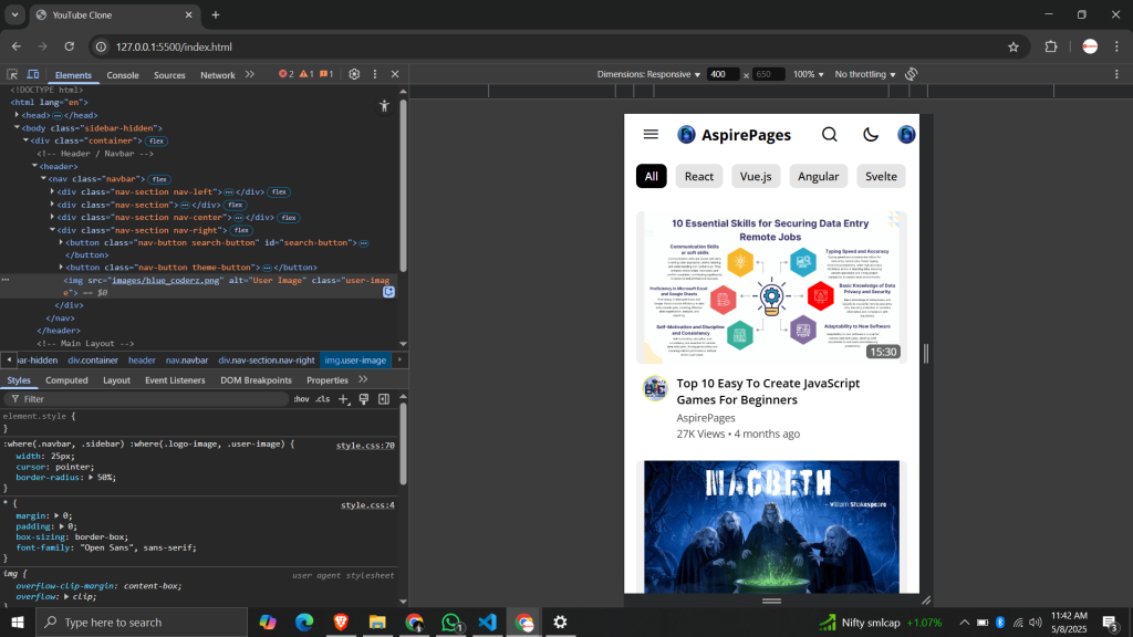
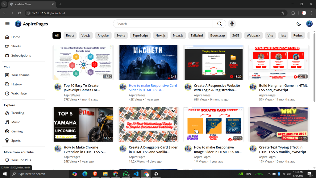
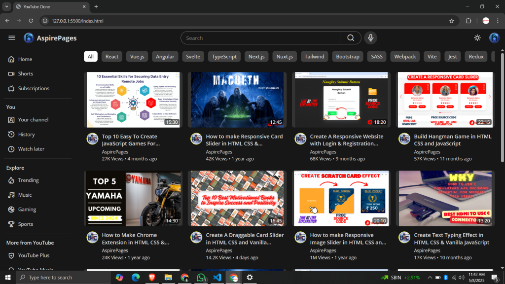
Project Overview:
This YouTube Clone replicates the look and feel of the popular video platform using just core web technologies.
Navigation bar with YouTube logo, search bar, and user icons
Sidebar menu for categories and navigation links
Video thumbnails arranged in a responsive grid layout
Day/Night toggle button to switch themes instantly
Fully responsive design that adapts to all screen sizes
The main highlight is the For YouTube Clone day/night toggle that smoothly changes the website’s colors from light mode to dark mode, improving usability and aesthetics.
This project is perfect for beginners to practice layout techniques, responsive design, and JavaScript event handling.
Step 1: HTML For YouTube Clone:
HTML Code
<!DOCTYPE html>
<html lang="en">
  <head>
    <meta charset="UTF-8" />
    <meta name="viewport" content="width=device-width, initial-scale=1.0" />
    <title>YouTube Clone </title>

    <link rel="stylesheet" href="https://unicons.iconscout.com/release/v4.0.8/css/line.css" />
    <link rel="shortcut icon" href="./images/blue_coderz.png" type="image/x-icon">
    <link rel="stylesheet" href="style.css" />
  </head>
  <body class="sidebar-hidden">
    <div class="container">
      <!-- Header / Navbar -->
      <header>
        <nav class="navbar">
          <div class="nav-section nav-left">
            <button class="nav-button menu-button">
              <i class="uil uil-bars"></i>
            </button>
            <a href="https://aspirepages.in/" class="nav-logo">
              <img src="images/blue_coderz.png" alt="Logo" class="logo-image" />
              <h2 class="logo-text">AspirePages</h2>
            </a>
          </div>

          <div class="nav-section">
            <button class="nav-button search-back-button" id="search-back-button">
              <i class="uil uil-arrow-left"></i>
            </button>
          </div>

          <div class="nav-section nav-center">
            <form action="https://aspirepages.in/" class="search-form">
              <input type="search" placeholder="Search" class="search-input" required />
              <button class="nav-button search-button">
                <i class="uil uil-search"></i>
              </button>
            </form>
            <button class="nav-button mic-button">
              <i class="uil uil-microphone"></i>
            </button>
          </div>

          <div class="nav-section nav-right">
            <button class="nav-button search-button" id="search-button">
              <i class="uil uil-search"></i>
            </button>
            <button class="nav-button theme-button">
              <i class="uil uil-moon"></i>
            </button>
            <img src="images/blue_coderz.png" alt="User Image" class="user-image" />
          </div>
        </nav>
      </header>

      <!-- Main Layout -->
      <main class="main-layout">
        <div class="screen-overlay"></div>

        <!-- Sidebar -->
        <aside class="sidebar">
          <div class="nav-section nav-left">
            <button class="nav-button menu-button">
              <i class="uil uil-bars"></i>
            </button>
            <a href="https://aspirepages.in/" class="nav-logo">
              <img src="images/logo.png" alt="Logo" class="logo-image" />
              <h2 class="logo-text">CnTube</h2>
            </a>
          </div>

          <div class="links-container">
            <div class="link-section">
              <a href="https://aspirepages.in/" class="link-item"> <i class="uil uil-estate"></i> Home </a>
              <a href="https://aspirepages.in/" class="link-item"> <i class="uil uil-video"></i> Shorts </a>
              <a href="https://aspirepages.in/" class="link-item"> <i class="uil uil-tv-retro"></i> Subscriptions </a>
            </div>
            <div class="section-separator"></div>

            <div class="link-section">
              <h4 class="section-title">You</h4>
              <a href="https://aspirepages.in/" class="link-item"> <i class="uil uil-user-square"></i> Your channel </a>
              <a href="https://aspirepages.in/" class="link-item"> <i class="uil uil-history"></i> History </a>
              <a href="https://aspirepages.in/" class="link-item"> <i class="uil uil-clock"></i> Watch later </a>
            </div>
            <div class="section-separator"></div>

            <div class="link-section">
              <h4 class="section-title">Explore</h4>
              <a href="https://aspirepages.in/" class="link-item"> <i class="uil uil-fire"></i> Trending </a>
              <a href="https://aspirepages.in/" class="link-item"> <i class="uil uil-music"></i> Music </a>
              <a href="https://aspirepages.in/" class="link-item"> <i class="uil uil-basketball"></i> Gaming </a>
              <a href="https://aspirepages.in/" class="link-item"> <i class="uil uil-trophy"></i> Sports </a>
            </div>
            <div class="section-separator"></div>

            <div class="link-section">
              <h4 class="section-title">More from YouTube</h4>
              <a href="https://aspirepages.in/" class="link-item"> <i class="uil uil-shield-plus"></i> YouTube Plus </a>
              <a href="https://aspirepages.in/" class="link-item"> <i class="uil uil-headphones-alt"></i> YouTube Music </a>
              <a href="https://aspirepages.in/" class="link-item"> <i class="uil uil-airplay"></i> YouTube Kids </a>
            </div>
            <div class="section-separator"></div>

            <div class="link-section">
              <a href="https://aspirepages.in/" class="link-item"> <i class="uil uil-setting"></i> Settings </a>
              <a href="https://aspirepages.in/" class="link-item"> <i class="uil uil-file-medical-alt"></i> Report </a>
              <a href="https://aspirepages.in/" class="link-item"> <i class="uil uil-question-circle"></i> Help </a>
              <a href="https://aspirepages.in/" class="link-item"> <i class="uil uil-exclamation-triangle"></i> Feedback </a>
            </div>
          </div>
        </aside>

        <div class="content-wrapper">
          <!-- Category List -->
          <div class="category-list">
            <button class="category-button active">All</button>
            <button class="category-button">React</button>
            <button class="category-button">Vue.js</button>
            <button class="category-button">Angular</button>
            <button class="category-button">Svelte</button>
            <button class="category-button">TypeScript</button>
            <button class="category-button">Next.js</button>
            <button class="category-button">Nuxt.js</button>
            <button class="category-button">Tailwind</button>
            <button class="category-button">Bootstrap</button>
            <button class="category-button">SASS</button>
            <button class="category-button">Webpack</button>
            <button class="category-button">Vite</button>
            <button class="category-button">Jest</button>
            <button class="category-button">Redux</button>
            <button class="category-button">GraphQL</button>
          </div>

          <!-- Video List -->
          <div class="video-list">
            <a href="https://aspirepages.in/" class="video-card">
              <div class="thumbnail-container">
                <img src="https://pub-271ea12ff8384e36bd6e881cbdee25a5.r2.dev/10%20Essential%20Skills%20for%20Securing%20Data%20Entry%20Remote%20Jobs%20(1).png" alt="Video Thumbnail" class="thumbnail" />
                <p class="duration">15:30</p>
              </div>
              <div class="video-info">
                <img src="https://pub-271ea12ff8384e36bd6e881cbdee25a5.r2.dev/pixelcut-export.png" alt="Channel Logo" class="icon" />
                <div class="video-details">
                  <h2 class="title">Top 10 Easy To Create JavaScript Games For Beginners</h2>
                  <p class="channel-name">AspirePages</p>
                  <p class="views">27K Views • 4 months ago</p>
                </div>
              </div>
            </a>
            <a href="https://aspirepages.in/" class="video-card">
              <div class="thumbnail-container">
                <img src="https://pub-271ea12ff8384e36bd6e881cbdee25a5.r2.dev/CanterMacbeth3d.png" alt="Video Thumbnail" class="thumbnail" />
                <p class="duration">12:45</p>
              </div>
              <div class="video-info">
                <img src="https://pub-271ea12ff8384e36bd6e881cbdee25a5.r2.dev/pixelcut-export.png" alt="Channel Logo" class="icon" />
                <div class="video-details">
                  <h2 class="title">How to make Responsive Card Slider in HTML CSS & JavaScript</h2>
                  <p class="channel-name">AspirePages</p>
                  <p class="views">42K Views • 1 year ago</p>
                </div>
              </div>
            </a>
            <a href="https://aspirepages.in/" class="video-card">
              <div class="thumbnail-container">
                <img src="https://pub-271ea12ff8384e36bd6e881cbdee25a5.r2.dev/Naughty%20Submit%20Button.png" alt="Video Thumbnail" class="thumbnail" />
                <p class="duration">18:20</p>
              </div>
              <div class="video-info">
                <img src="https://pub-271ea12ff8384e36bd6e881cbdee25a5.r2.dev/pixelcut-export.png" alt="Channel Logo" class="icon" />
                <div class="video-details">
                  <h2 class="title">Create A Responsive Website with Login & Registration Form in HTML CSS and JavaScript</h2>
                  <p class="channel-name">AspirePages</p>
                  <p class="views">68K Views • 9 months ago</p>
                </div>
              </div>
            </a>
            <a href="https://aspirepages.in/" class="video-card">
              <div class="thumbnail-container">
                <img src="https://pub-271ea12ff8384e36bd6e881cbdee25a5.r2.dev/Responsive%20Card%20Slider.png" alt="Video Thumbnail" class="thumbnail" />
                <p class="duration">22:15</p>
              </div>
              <div class="video-info">
                <img src="https://pub-271ea12ff8384e36bd6e881cbdee25a5.r2.dev/pixelcut-export.png" alt="Channel Logo" class="icon" />
                <div class="video-details">
                  <h2 class="title">Build Hangman Game in HTML CSS and JavaScript</h2>
                  <p class="channel-name">AspirePages</p>
                  <p class="views">57K Views • 11 months ago</p>
                </div>
              </div>
            </a>
            <a href="https://aspirepages.in/" class="video-card">
              <div class="thumbnail-container">
                <img src="https://pub-271ea12ff8384e36bd6e881cbdee25a5.r2.dev/YAMAHA%20(1).png" alt="Video Thumbnail" class="thumbnail" />
                <p class="duration">14:30</p>
              </div>
              <div class="video-info">
                <img src="https://pub-271ea12ff8384e36bd6e881cbdee25a5.r2.dev/pixelcut-export.png" alt="Channel Logo" class="icon" />
                <div class="video-details">
                  <h2 class="title">How to Make Chrome Extension in HTML CSS & JavaScript</h2>
                  <p class="channel-name">AspirePages</p>
                  <p class="views">24K Views • 1 year ago</p>
                </div>
              </div>
            </a>
            <a href="https://aspirepages.in/" class="video-card">
              <div class="thumbnail-container">
                <img src="https://pub-271ea12ff8384e36bd6e881cbdee25a5.r2.dev/finalbg.png" alt="Video Thumbnail" class="thumbnail" />
                <p class="duration">16:45</p>
              </div>
              <div class="video-info">
                <img src="https://pub-271ea12ff8384e36bd6e881cbdee25a5.r2.dev/pixelcut-export.png" alt="Channel Logo" class="icon" />
                <div class="video-details">
                  <h2 class="title">Create A Draggable Card Slider in HTML CSS and Vanilla JavaScript</h2>
                  <p class="channel-name">AspirePages</p>
                  <p class="views">14.2K Views • 4 days ago</p>
                </div>
              </div>
            </a>
            <a href="https://aspirepages.in/" class="video-card">
              <div class="thumbnail-container">
                <img src="https://pub-271ea12ff8384e36bd6e881cbdee25a5.r2.dev/final-768x451.png" alt="Video Thumbnail" class="thumbnail" />
                <p class="duration">20:10</p>
              </div>
              <div class="video-info">
                <img src="https://pub-271ea12ff8384e36bd6e881cbdee25a5.r2.dev/pixelcut-export.png" alt="Channel Logo" class="icon" />
                <div class="video-details">
                  <h2 class="title">How to make Responsive Image Slider in HTML CSS and JavaScript</h2>
                  <p class="channel-name">AspirePages</p>
                  <p class="views">1M Views • 1 year ago</p>
                </div>
              </div>
            </a>
            <a href="https://aspirepages.in/" class="video-card">
              <div class="thumbnail-container">
                <img src="https://pub-271ea12ff8384e36bd6e881cbdee25a5.r2.dev/d2.png" alt="Video Thumbnail" class="thumbnail" />
                <p class="duration">13:20</p>
              </div>
              <div class="video-info">
                <img src="https://pub-271ea12ff8384e36bd6e881cbdee25a5.r2.dev/pixelcut-export.png" alt="Channel Logo" class="icon" />
                <div class="video-details">
                  <h2 class="title">Create Text Typing Effect in HTML CSS & Vanilla JavaScript</h2>
                  <p class="channel-name">AspirePages</p>
                  <p class="views">17K Views • 10 months ago</p>
                </div>
              </div>
            </a>
            <a href="https://aspirepages.in/" class="video-card">
              <div class="thumbnail-container">
                <img src="https://pub-271ea12ff8384e36bd6e881cbdee25a5.r2.dev/10%20Essential%20Skills%20for%20Securing%20Data%20Entry%20Remote%20Jobs%20(1).png" alt="Video Thumbnail" class="thumbnail" />
                <p class="duration">15:30</p>
              </div>
              <div class="video-info">
                <img src="https://pub-271ea12ff8384e36bd6e881cbdee25a5.r2.dev/pixelcut-export.png" alt="Channel Logo" class="icon" />
                <div class="video-details">
                  <h2 class="title">Create Responsive Image Slider in HTML CSS and JavaScript</h2>
                  <p class="channel-name">AspirePages</p>
                  <p class="views">157K Views • 9 months ago</p>
                </div>
              </div>
            </a>
            <a href="https://aspirepages.in/" class="video-card">
              <div class="thumbnail-container">
                <img src="https://pub-271ea12ff8384e36bd6e881cbdee25a5.r2.dev/CanterMacbeth3d.png" alt="Video Thumbnail" class="thumbnail" />
                <p class="duration">12:45</p>
              </div>
              <div class="video-info">
                <img src="https://pub-271ea12ff8384e36bd6e881cbdee25a5.r2.dev/pixelcut-export.png" alt="Channel Logo" class="icon" />
                <div class="video-details">
                  <h2 class="title">Make A Flipping Card UI Design in HTML & CSS</h2>
                  <p class="channel-name">AspirePages</p>
                  <p class="views">85K Views • 2 months ago</p>
                </div>
              </div>
            </a>
            <a href="https://aspirepages.in/" class="video-card">
              <div class="thumbnail-container">
                <img src="https://pub-271ea12ff8384e36bd6e881cbdee25a5.r2.dev/Naughty%20Submit%20Button.png" alt="Video Thumbnail" class="thumbnail" />
                <p class="duration">18:20</p>
              </div>
              <div class="video-info">
                <img src="https://pub-271ea12ff8384e36bd6e881cbdee25a5.r2.dev/pixelcut-export.png" alt="Channel Logo" class="icon" />
                <div class="video-details">
                  <h2 class="title">Easy way to do Multiple File Uploading using HTML CSS and JavaScript</h2>
                  <p class="channel-name">AspirePages</p>
                  <p class="views">7.4K Views • 3 weeks ago</p>
                </div>
              </div>
            </a>
            <a href="https://aspirepages.in/" class="video-card">
              <div class="thumbnail-container">
                <img src="https://pub-271ea12ff8384e36bd6e881cbdee25a5.r2.dev/Responsive%20Card%20Slider.png" alt="Video Thumbnail" class="thumbnail" />
                <p class="duration">22:15</p>
              </div>
              <div class="video-info">
                <img src="https://pub-271ea12ff8384e36bd6e881cbdee25a5.r2.dev/pixelcut-export.png" alt="Channel Logo" class="icon" />
                <div class="video-details">
                  <h2 class="title">Build A Responsive Calculator in HTML CSS & JavaScript</h2>
                  <p class="channel-name">AspirePages</p>
                  <p class="views">30K Views • 2 years ago</p>
                </div>
              </div>
            </a>
            <a href="https://aspirepages.in/" class="video-card">
              <div class="thumbnail-container">
                <img src="https://pub-271ea12ff8384e36bd6e881cbdee25a5.r2.dev/YAMAHA%20(1).png" alt="Video Thumbnail" class="thumbnail" />
                <p class="duration">14:30</p>
              </div>
              <div class="video-info">
                <img src="https://pub-271ea12ff8384e36bd6e881cbdee25a5.r2.dev/pixelcut-export.png" alt="Channel Logo" class="icon" />
                <div class="video-details">
                  <h2 class="title">Build A Currency Converter using ReactJS</h2>
                  <p class="channel-name">AspirePages</p>
                  <p class="views">7.2K • 2 weeks ago</p>
                </div>
              </div>
            </a>
            <a href="https://aspirepages.in/" class="video-card">
              <div class="thumbnail-container">
                <img src="https://pub-271ea12ff8384e36bd6e881cbdee25a5.r2.dev/finalbg.png" alt="Video Thumbnail" class="thumbnail" />
                <p class="duration">16:45</p>
              </div>
              <div class="video-info">
                <img src="https://pub-271ea12ff8384e36bd6e881cbdee25a5.r2.dev/pixelcut-export.png" alt="Channel Logo" class="icon" />
                <div class="video-details">
                  <h2 class="title">Responsive Admin Dashboard Panel in HTML CSS and JavaScript</h2>
                  <p class="channel-name">AspirePages</p>
                  <p class="views">161K Views • 1 year ago</p>
                </div>
              </div>
            </a>
          </div>
        </div>
      </main>
    </div>

    <!-- Linking custom script -->
    <script src="script.js"></script>
  </body>
</html>
HTML Explanation For YouTube Clone:
Document Setup & Head Section
<!DOCTYPE html>
<html lang="en">
<head>
  <meta charset="UTF-8" />
  <meta name="viewport" content="width=device-width, initial-scale=1.0" />
  <title>YouTube Clone </title>

  <link rel="stylesheet" href="https://unicons.iconscout.com/release/v4.0.8/css/line.css" />
  <link rel="shortcut icon" href="./images/blue_coderz.png" type="image/x-icon">
  <link rel="stylesheet" href="style.css" />
</head>
<!DOCTYPE html>: Declares the document as HTML5.<html lang="en">: Starts the HTML document, language set to English.- Meta tags:
charset="UTF-8"ensures proper encoding.viewportfor responsive scaling on different devices.
<title>sets the page title shown on the browser tab.- Stylesheets and icons:
- Loads Unicons icon library for icons.
- Sets a favicon for the page.
- Links to your custom CSS file (
style.css) for page styling.
Body & Main Container
<body class="sidebar-hidden">
  <div class="container">
- The
<body>tag contains the visible content. - Class
sidebar-hiddenmay control sidebar visibility by default. - A wrapper
<div class="container">encloses all main content.
Header & Navbar
<header>
  <nav class="navbar">
    <div class="nav-section nav-left">
      <button class="nav-button menu-button">
        <i class="uil uil-bars"></i>
      </button>
      <a href="https://aspirepages.in/" class="nav-logo">
        <img src="images/blue_coderz.png" alt="Logo" class="logo-image" />
        <h2 class="logo-text">AspirePages</h2>
      </a>
    </div>
    ...
  </nav>
</header>
- Header holds the top navigation bar.
- Navbar contains several sections (
nav-left,nav-center,nav-right). - Menu button with hamburger icon toggles sidebar visibility.
- Logo is a clickable link with image and text branding.
- Search form and microphone icon allow users to search videos.
- Right side has buttons for search toggle, theme switch (dark/light), and user image.
Main Layout & Sidebar
<main class="main-layout">
  <div class="screen-overlay"></div>

  <aside class="sidebar">
    <div class="nav-section nav-left">
      <button class="nav-button menu-button">
        <i class="uil uil-bars"></i>
      </button>
      <a href="https://aspirepages.in/" class="nav-logo">
        <img src="images/logo.png" alt="Logo" class="logo-image" />
        <h2 class="logo-text">CnTube</h2>
      </a>
    </div>
    <div class="links-container">
      <div class="link-section">
        <a href="https://aspirepages.in/" class="link-item"><i class="uil uil-estate"></i> Home </a>
        ...
      </div>
      ...
    </div>
  </aside>
- The main area holds the layout and sidebar.
screen-overlaycould be used for dimming the background when sidebar is open on small screens.- Sidebar contains navigation links organized into sections like Home, Shorts, Subscriptions, You, Explore, More from YouTube, and Settings.
- Each link has an icon from Unicons and text.
- The sidebar can be toggled open or closed with the menu button.
Content Area — Categories and Video List
<div class="content-wrapper">
  <!-- Category List -->
  <div class="category-list">
    <button class="category-button active">All</button>
    <button class="category-button">React</button>
    ...
  </div>

  <!-- Video List -->
  <div class="video-list">
    <a href="https://aspirepages.in/" class="video-card">
      <div class="thumbnail-container">
        <img src="..." alt="Video Thumbnail" class="thumbnail" />
        <p class="duration">15:30</p>
      </div>
      <div class="video-info">
        <img src="..." alt="Channel Logo" class="icon" />
        <div class="video-details">
          <h2 class="title">Video Title</h2>
          <p class="channel-name">Channel Name</p>
          <p class="views">27K Views • 4 months ago</p>
        </div>
      </div>
    </a>
    ...
  </div>
</div>
- Category list is a horizontal set of buttons for filtering videos by topic.
- The video list shows multiple video cards.
- Each card is a link that includes:
- Video thumbnail with a duration label.
- Channel icon.
- Video title, channel name, and view stats.
- This mimics the familiar YouTube video feed UI.
Step 2 : CSS For YouTube Clone:
CSS Code For YouTube Clone
/* Importing Google Font - Open Sans */
@import url("https://fonts.googleapis.com/css2?family=Open+Sans:wght@400;500;600;700&display=swap");

* {
  margin: 0;
  padding: 0;
  box-sizing: border-box;
  font-family: "Open Sans", sans-serif;
}

/* Color variables for light theme */
:root {
  --white-color: #fff;
  --black-color: #000;
  --light-white-color: #f0f0f0;
  --light-gray-color: #e5e5e5;
  --border-color: #ccc;
  --primary-color: #3b82f6;
  --secondary-color: #404040;
  --overlay-dark-color: rgba(0, 0, 0, 0.6);
}

/* Color variables for dark theme */
.dark-mode {
  --white-color: #171717;
  --black-color: #d4d4d4;
  --light-white-color: #333;
  --light-gray-color: #404040;
  --border-color: #808080;
  --secondary-color: #d4d4d4;
}

body {
  background: var(--white-color);
}

.container {
  display: flex;
  overflow: hidden;
  max-height: 100vh;
  flex-direction: column;
}

header,
.sidebar .nav-left,
.category-list {
  position: sticky;
  top: 0;
  z-index: 10;
  background: var(--white-color);
}

.navbar {
  display: flex;
  gap: 32px;
  align-items: center;
  padding: 8px 16px;
  justify-content: space-between;
}

:where(.navbar, .sidebar) .nav-section {
  gap: 16px;
}

:where(.navbar, .sidebar) :where(.nav-section, .nav-logo, .search-form) {
  display: flex;
  align-items: center;
}

:where(.navbar, .sidebar) :where(.logo-image, .user-image) {
  width: 32px;
  cursor: pointer;
  border-radius: 50%;
}

:where(.navbar, .sidebar) .nav-section .nav-button {
  border: none;
  height: 40px;
  width: 40px;
  cursor: pointer;
  background: none;
  border-radius: 50%;
}

:where(.navbar, .sidebar) .nav-section .nav-button:hover {
  background: var(--light-gray-color) !important;
}

:where(.navbar, .sidebar) .nav-button i {
  font-size: 1.5rem;
  display: flex;
  color: var(--black-color);
  align-items: center;
  justify-content: center;
}

:where(.navbar, .sidebar) .nav-logo {
  display: flex;
  gap: 8px;
  text-decoration: none;
}

:where(.navbar, .sidebar) .nav-logo .logo-text {
  color: var(--black-color);
  font-size: 1.25rem;
}

.navbar .search-back-button {
  display: none;
}

.navbar .nav-center {
  gap: 8px;
  width: 100%;
  display: flex;
  justify-content: center;
}

.navbar .search-form {
  flex: 1;
  height: 40px;
  max-width: 550px;
}

.navbar .search-form .search-input {
  width: 100%;
  height: 100%;
  font-size: 1rem;
  padding: 0 16px;
  outline: none;
  color: var(--black-color);
  background: var(--white-color);
  border-radius: 49px 0 0 49px;
  border: 1px solid var(--border-color);
}

.navbar .search-form .search-input:focus {
  border-color: var(--primary-color);
}

.navbar .search-form .search-button {
  height: 40px;
  width: auto;
  padding: 0 20px;
  border-radius: 0 49px 49px 0;
  border: 1px solid var(--border-color);
  border-left: 0;
}

.navbar .nav-center .mic-button {
  background: var(--light-white-color);
}

.navbar .nav-right .search-button {
  display: none;
}

.main-layout {
  display: flex;
  overflow-y: auto;
  scrollbar-color: #a6a6a6 transparent;
}

.main-layout .sidebar {
  width: 280px;
  overflow: hidden;
  padding: 0 11px 0;
  background: var(--white-color);
}

.main-layout .sidebar .nav-left {
  display: none;
  padding: 8px 5px;
}

body.sidebar-hidden .main-layout .sidebar {
  width: 0;
  padding: 0;
}

.sidebar .links-container {
  padding: 16px 0 32px;
  overflow-y: auto;
  height: calc(100vh - 60px);
  scrollbar-width: thin;
  scrollbar-color: transparent transparent;
}

.sidebar .links-container:hover {
  scrollbar-color: #a6a6a6 transparent;
}

.sidebar .link-section {
  list-style: none;
}

.sidebar .link-section .link-item {
  display: flex;
  cursor: pointer;
  color: var(--black-color);
  white-space: nowrap;
  align-items: center;
  font-size: 0.938rem;
  padding: 5px 12px;
  margin-bottom: 4px;
  border-radius: 8px;
  text-decoration: none;
}

.sidebar .link-section .link-item:hover {
  background: var(--light-gray-color);
}

.sidebar .link-section .link-item i {
  font-size: 1.4rem;
  margin-right: 10px;
}

.sidebar .link-section .section-title {
  color: var(--black-color);
  font-weight: 600;
  font-size: 0.938rem;
  margin: 16px 0 8px 8px;
}

.sidebar .section-separator {
  height: 1px;
  margin: 10px 0;
  background: var(--light-gray-color);
}

.main-layout .content-wrapper {
  padding: 0 16px;
  overflow-x: hidden;
  width: 100%;
}

.content-wrapper .category-list {
  display: flex;
  overflow-x: auto;
  gap: 12px;
  padding: 12px 0 11px;
  scrollbar-width: none;
}

.category-list .category-button {
  border: none;
  cursor: pointer;
  font-weight: 500;
  font-size: 0.94rem;
  border-radius: 8px;
  white-space: nowrap;
  color: var(--black-color);
  padding: 6px 12px;
  background: var(--light-gray-color);
}

.category-list .category-button.active {
  color: var(--white-color);
  background: var(--black-color);
  pointer-events: none;
}

.dark-mode .category-list .category-button.active {
  filter: brightness(120%);
}

.category-list .category-button:not(.active):hover {
  background: var(--border-color);
}

.content-wrapper .video-list {
  display: grid;
  gap: 16px;
  padding: 20px 0 64px;
  grid-template-columns: repeat(auto-fill, minmax(300px, 1fr));
}

.content-wrapper .video-list .video-card {
  text-decoration: none;
}

.content-wrapper .video-list .video-card .thumbnail-container {
  position: relative;
}

.content-wrapper .video-list .video-card .thumbnail {
  width: 100%;
  object-fit: contain;
  border-radius: 8px;
  aspect-ratio: 16 / 9;
  background: var(--light-white-color);
}

.content-wrapper .video-list .video-card .duration {
  position: absolute;
  right: 10px;
  bottom: 12px;
  color: #fff;
  font-size: 0.875rem;
  padding: 0 5px;
  border-radius: 5px;
  background: var(--overlay-dark-color);
}

.content-wrapper .video-list .video-card .video-info {
  display: flex;
  gap: 11px;
  padding: 11px 8px;
}

.content-wrapper .video-list .video-card .icon {
  width: 36px;
  height: 36px;
  border-radius: 50%;
}

.content-wrapper .video-list .video-card .title {
  font-size: 1rem;
  color: var(--black-color);
  font-weight: 600;
  line-height: 1.375;
  overflow: hidden;
  display: -webkit-box;
  -webkit-box-orient: vertical;
  -webkit-line-clamp: 2;
}

.content-wrapper .video-list .video-card:hover .title {
  color: var(--primary-color);
}

.content-wrapper .video-list .video-card p {
  font-size: 0.875rem;
  color: var(--secondary-color);
}

.content-wrapper .video-list .video-card .channel-name {
  margin: 4px 0 2px;
}

/* Responsive media code for small devices */
@media (max-width: 768px) {

  .navbar {
    gap: 1rem;
  }

  .navbar .nav-center,
  body.show-mobile-search .navbar .nav-left,
  body.show-mobile-search .navbar .nav-right {
    display: none;
  }

  .navbar .nav-right .search-button,
  body.show-mobile-search .navbar .search-back-button,
  body.show-mobile-search .navbar .nav-center {
    display: flex;
    align-items: center;
    justify-content: center;
  }

  .main-layout .screen-overlay {
    position: absolute;
    left: 0;
    top: 0;
    z-index: 15;
    width: 100%;
    height: 100vh;
    background: var(--overlay-dark-color);
    transition: 0.2s ease;
  }

  body.sidebar-hidden .main-layout .screen-overlay {
    opacity: 0;
    pointer-events: none;
  }

  .main-layout .sidebar {
    position: absolute;
    left: 0;
    top: 0;
    z-index: 20;
    height: 100vh;
    transition: 0.2s ease;
  }

  body.sidebar-hidden .main-layout .sidebar {
    left: -280px;
  }

  .main-layout .sidebar .nav-left {
    display: flex;
  }
}
CSS Explanation For YouTube Clone:
Import Google Font
@import url("https://fonts.googleapis.com/css2?family=Open+Sans:wght@400;500;600;700&display=swap");
- Imports the “Open Sans” font from Google Fonts to use throughout the site.
Global Reset and Font Setup
* {
  margin: 0;
  padding: 0;
  box-sizing: border-box;
  font-family: "Open Sans", sans-serif;
}
- Resets default spacing for all elements.
- Uses
border-boxsizing model for easier layout control. - Applies “Open Sans” font globally.
Color Variables for Light Theme
:root {
  --white-color: #fff;
  --black-color: #000;
  --light-white-color: #f0f0f0;
  --light-gray-color: #e5e5e5;
  --border-color: #ccc;
  --primary-color: #3b82f6;
  --secondary-color: #404040;
  --overlay-dark-color: rgba(0, 0, 0, 0.6);
}
- Defines reusable color variables for the light theme.
Dark Mode Color Overrides
.dark-mode {
  --white-color: #171717;
  --black-color: #d4d4d4;
  --light-white-color: #333;
  --light-gray-color: #404040;
  --border-color: #808080;
  --secondary-color: #d4d4d4;
}
- Changes color variables when
.dark-modeclass is active to support dark theme.
Body Background Color
body {
  background: var(--white-color);
}
- Sets the page background color based on the current theme.
Container Setup
.container {
  display: flex;
  overflow: hidden;
  max-height: 100vh;
  flex-direction: column;
}
- Creates a vertical flex container limited to viewport height without overflow.
Sticky Header and Navigation Elements
header,
.sidebar .nav-left,
.category-list {
  position: sticky;
  top: 0;
  z-index: 10;
  background: var(--white-color);
}
- Makes header, sidebar navigation, and category list stick to top when scrolling.
Navbar Layout and Spacing
.navbar {
  display: flex;
  gap: 32px;
  align-items: center;
  padding: 8px 16px;
  justify-content: space-between;
}
- Arranges navbar items horizontally with spacing and vertical centering.
Spacing in Navbar and Sidebar Sections
cssCopyEdit:where(.navbar, .sidebar) .nav-section {
  gap: 16px;
}
- Adds space between nav sections inside navbar and sidebar.
Flex Alignment for Navbar and Sidebar Components
:where(.navbar, .sidebar) :where(.nav-section, .nav-logo, .search-form) {
  display: flex;
  align-items: center;
}
- Ensures nav sections, logos, and search forms align their items vertically.
Logo and User Image Styling
:where(.navbar, .sidebar) :where(.logo-image, .user-image) {
  width: 32px;
  cursor: pointer;
  border-radius: 50%;
}
- Sets fixed circular size for logos and user avatars, making them clickable.
Navigation Button Styling
:where(.navbar, .sidebar) .nav-section .nav-button {
  border: none;
  height: 40px;
  width: 40px;
  cursor: pointer;
  background: none;
  border-radius: 50%;
}
- Styles navigation buttons as round, borderless clickable icons.
Navigation Button Hover Effect
:where(.navbar, .sidebar) .nav-section .nav-button:hover {
  background: var(--light-gray-color) !important;
}
- Adds a background color when hovering over nav buttons for feedback.
Icon Styling Inside Nav Buttons
:where(.navbar, .sidebar) .nav-button i {
  font-size: 1.5rem;
  color: var(--black-color);
  display: flex;
  align-items: center;
  justify-content: center;
}
- Sets icon size and centers it inside nav buttons.
Navbar Logo Layout
.navbar .nav-logo {
  display: flex;
  gap: 8px;
  text-decoration: none;
}
- Arranges logo elements horizontally with spacing and no underline on links.
Navbar Logo Text Styling
.navbar .nav-logo .logo-text {
  color: var(--black-color);
  font-size: 1.25rem;
}
- Styles logo text with theme color and increased font size.
Search Form Layout and Size
.navbar .search-form {
  flex: 1;
  height: 40px;
  max-width: 550px;
}
- Makes search form flexible but limits max width and sets height.
Search Input Styling
.navbar .search-form .search-input {
  width: 100%;
  height: 100%;
  font-size: 1rem;
  padding: 0 16px;
  color: var(--black-color);
  background: var(--white-color);
  border-radius: 49px 0 0 49px;
  border: 1px solid var(--border-color);
}
- Styles input to fill the search form, with padding and rounded left corners.
Search Input Focus Style
.navbar .search-form .search-input:focus {
  border-color: var(--primary-color);
}
- Changes border color on focus for user clarity.
Search Button Styling
.navbar .search-form .search-button {
  height: 40px;
  padding: 0 20px;
  border-radius: 0 49px 49px 0;
  border: 1px solid var(--border-color);
  border-left: 0;
}
- Styles search button with rounded right corners and merges visually with input.
Main Layout Flex and Scrolling
.main-layout {
  display: flex;
  overflow-y: auto;
  scrollbar-color: #a6a6a6 transparent;
}
- Sets up main layout as horizontal flex container with vertical scroll and custom scrollbar colors.
Sidebar Width and Background
.main-layout .sidebar {
  width: 280px;
  padding: 0 20px;
  background: var(--white-color);
  border-right: 1px solid var(--border-color);
  overflow-y: auto;
}
- Sidebar fixed width with padding, background color, right border, and vertical scrolling.
Step 3 : JavaScript For YouTube Clone:
JavaScript Code For YouTube Clone
const menuButtons = document.querySelectorAll(".menu-button");
const screenOverlay = document.querySelector(".main-layout .screen-overlay");
const themeButton = document.querySelector(".navbar .theme-button i");
const searchButton = document.querySelector("#search-button");
const searchBackButton = document.querySelector("#search-back-button");

// Toggle sidebar visibility when menu buttons are clicked
menuButtons.forEach((button) => {
  button.addEventListener("click", () => {
    document.body.classList.toggle("sidebar-hidden");
  });
});

// Toggle sidebar visibility when screen overlay is clicked
screenOverlay.addEventListener("click", () => {
  document.body.classList.toggle("sidebar-hidden");
});

// Initialize dark mode based on localStorage
if (localStorage.getItem("darkMode") === "enabled") {
  document.body.classList.add("dark-mode");
  themeButton.classList.replace("uil-moon", "uil-sun");
} else {
  themeButton.classList.replace("uil-sun", "uil-moon");
}

// Toggle dark mode when theme button is clicked
themeButton.addEventListener("click", () => {
  const isDarkMode = document.body.classList.toggle("dark-mode");
  localStorage.setItem("darkMode", isDarkMode ? "enabled" : "disabled");
  themeButton.classList.toggle("uil-sun", isDarkMode);
  themeButton.classList.toggle("uil-moon", !isDarkMode);
});

// Show sidebar on large screens by default
if (window.innerWidth >= 768) {
  document.body.classList.remove("sidebar-hidden");
}

// Toggle search bar on click on mobile
const toggleSearchBar = () => {
  document.body.classList.toggle("show-mobile-search");
};

searchButton.addEventListener("click", toggleSearchBar);
searchBackButton.addEventListener("click", () => searchButton.click());
JavaScript Explantion For YouTube Clone
Selecting Key Elements
const menuButtons = document.querySelectorAll(".menu-button");
const screenOverlay = document.querySelector(".main-layout .screen-overlay");
const themeButton = document.querySelector(".navbar .theme-button i");
const searchButton = document.querySelector("#search-button");
const searchBackButton = document.querySelector("#search-back-button");
- Selects important DOM elements to interact with later:
- All menu toggle buttons.
- The overlay that appears when sidebar is open.
- The icon inside the theme toggle button.
- The search button and back button for mobile search.
Sidebar Toggle on Menu Button Click
jsCopyEditmenuButtons.forEach((button) => {
  button.addEventListener("click", () => {
    document.body.classList.toggle("sidebar-hidden");
  });
});
- Adds a click event to each menu button.
- Clicking toggles the
"sidebar-hidden"class on<body>, showing or hiding the sidebar.
Sidebar Toggle on Overlay Click
screenOverlay.addEventListener("click", () => {
  document.body.classList.toggle("sidebar-hidden");
});
- Clicking the overlay (darkened background behind sidebar) also toggles sidebar visibility by toggling
"sidebar-hidden"class on<body>.
Initialize Dark Mode from Local Storage
if (localStorage.getItem("darkMode") === "enabled") {
  document.body.classList.add("dark-mode");
  themeButton.classList.replace("uil-moon", "uil-sun");
} else {
  themeButton.classList.replace("uil-sun", "uil-moon");
}
- Checks if user previously enabled dark mode (stored in browser local storage).
- If yes, adds
"dark-mode"class to<body>to enable dark theme. - Also switches the theme toggle icon to a sun (
uil-sun) to indicate light mode is available. - If not enabled, sets icon to moon (
uil-moon).
Toggle Dark Mode on Theme Button Click
themeButton.addEventListener("click", () => {
  const isDarkMode = document.body.classList.toggle("dark-mode");
  localStorage.setItem("darkMode", isDarkMode ? "enabled" : "disabled");
  themeButton.classList.toggle("uil-sun", isDarkMode);
  themeButton.classList.toggle("uil-moon", !isDarkMode);
});
- Clicking the theme icon toggles
"dark-mode"on<body>. - Saves the user’s preference to local storage.
- Updates the icon to sun or moon accordingly.
Show Sidebar on Large Screens by Default
if (window.innerWidth >= 768) {
  document.body.classList.remove("sidebar-hidden");
}
- If the screen width is 768px or wider (tablet/desktop), the sidebar is shown by default by removing the
"sidebar-hidden"class.
Toggle Search Bar Visibility on Mobile
const toggleSearchBar = () => {
  document.body.classList.toggle("show-mobile-search");
};

searchButton.addEventListener("click", toggleSearchBar);
searchBackButton.addEventListener("click", () => searchButton.click());
- Defines a function to toggle the search bar on mobile by toggling
"show-mobile-search"class. - Clicking the search button toggles the mobile search visibility.
- Clicking the back button triggers the same toggle by programmatically clicking the search button again, effectively hiding the search bar.
Live Preview The Demo Website:
Download complete code :
Git Hub link :
Read our previous blog post :